-
• #2
Looks pretty good! If it becomes available I'll try it in my personal flavor of BW Clock. 👍
I don't really have any more constructive feedback I'm afraid. 😛
Off topic: Personally I would be interested to try storing custom fonts in storage as mentioned in this GitHub comment to see how that affects loading times.
-
• #3
Definitely interested. Even if we ended up with an alternative Vector font it would be worthwhile.
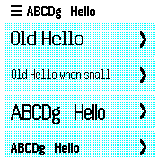
As you are probably aware, I'm a great fan of the Lato font as I find it attractive and clear.Even though I wear prescription glasses anything less than 20 height is fairly difficult for me to read. I used to have 20/20 vision 20 years ago.
-
• #4
I've just been having another stab at building this into the firmware.
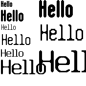
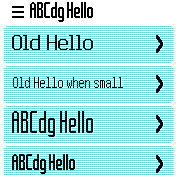
In the screenshot below, I'm showing items in 2x and 3x scales:
- First line is a new custom font - 14px high 'bold'. It's normally 12px, with 2px dropdown.
- Second line is 6x15 font
- Third line is 12x20 font
The scaling algorithms tend to smooth out the edges a bit so the 1px wide (non-bold) fonts don't scale up that well.
My thinking is:
- 6x15 at 1x scale is not really readable at 1x scale on the watch screen as it's too narrow
- The bold 14px font is more readable on the Bangle, and narrower, and scales up nicely compared to the others
- The 3x scale 14px font is a bit chunky, but it is very easy to read and is maybe worth it...
- It feels like we're maybe missing something inbetween the 1x and 2x scale 14px fonts (but in the same style), which could then scale up?
Right now, I'm feeling like what we need is to move away from having these weird font types like 6x4, 6x15, 12x20, and instead be able to say: "I want a bitmap font 20px high" and let Espruino choose?
Any maybe to allow us to migrate, we just map
12x20to this magic 20px high font, and6x15to the 15px one.Then maybe we have some way to override that, so that it's easy to upload a custom font for the whole OS?
I know everyone says: "You should allow the font size to be configurable" but we can't do that with the current apps without breaking 90% of them, but I guess changing the font (eg being able to make it bold, or more interesting, while being the same size) might still be good.
1 Attachment
- First line is a new custom font - 14px high 'bold'. It's normally 12px, with 2px dropdown.
-
• #5
Yes, we 100% need an 'inbetween' font, ideally that'll just fit in the 24px widget bar:
2 Attachments
-
• #6
Does anyone have thoughts on this, particularly making the built-in fonts substantially more bold?
I'm a bit concerned I'm going to spend a bunch of time on the new fonts and then I'll get a load of complaints because it's different.
-
• #7
For me it's always kind of hard to tell from pictures instead of the real watch, but I think it looks good in the menu bar.
To me it looks just too small/large in the scroller, but we could maybe resize scroll items?say: "I want a bitmap font 20px high" and let Espruino choose?
This would be nice to have. (And people could customize fonts globally without messing up layouts.)
-
• #8
Thanks!
To me it looks just too small/large in the scroller, but we could maybe resize scroll items?
Yes - that's the ~12px high font, and that is my feeling too. I think as a just-readable 'small' font it's ok, but then if you double-size it, it's too big. For the 'normal' font I think we need something bigger the doesn't need size-doubling.
If anyone would like to experiment, you can use this as a test - the 'font' is just written with
Xs in a string the start:var fontImg = Graphics.createImage(` XX XXXXX XXXXX XX XX XX XX XX XXXX XXXXXX XXXXXX XX XX XX XX XX XX XX XX XX XX XX XX XX XX XX XX XX XX XX XX XX XX XX XX XX XX XX XX XX XX XX XX XX XX XX XX XX XX XX XX XX XX XX XX XX XX XX XX XX XX XXXXX XXXX XX XX XXXX XX XX XXXX XXXXXX XXXXX XX XXXXXX XXXXXX XX XX XXXXXX XX XX XXXXXX XXXXXX XXXXX XX XX XX XX XX XXXXXX XX XX XX XX XX XX XX XX XX XX XX XX XX XX XX XXXXXX XX XX XX XX XX XX XX XX XX XX XX XX XX XX XX XX XX XX XX XX XX XX XX XX XX XX XX XX XX XX XX XX XX XX XX XX XX XX XX XX XX XX XX XX XX XX XX XX XX XX XX XXXXXX XX XX XX XX XX XX XX XX XX XX XX XX XX XX XX XXXXX XX XX XX XX XX XX XX XX XX XX XX XX XX XX XX XX XX XX XX XX XX XX XX XX XX XX XX XX XX XX XX XX XX XX XX XX XX XX XXXXXX XXXXXX XXXXXX XXXXXX XX XX XXXXXX XX XX XXXXXX XX XX XXXXXX XXXXX XXXXX XXXXX XX XX XXXXX XX XX XXXX XX XX XXXXXX XXXX `); var fontStr = String.fromCharCode(0,fontImg.width,fontImg.height,1+128,0)+fontImg.buffer; var menu = { "" : {title : fontStr}, "Old Hello" : function() {}, "Old Hello when small" : function() {} }; menu[fontStr] = function() {}; E.showMenu(menu);Right now that font is:
- 18px high (normally) maybe with a 4px drop-down for letters like 'g' (so 22px, so it can be used in the 24px widget bar)
- 2px wide lines
- 2px wide gap in letters
- 1px between letters
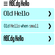
What does everyone think? Looking at it on a watch on my desk with the backlight off, it feels:
- It's less readable than the current 'normal' font
- You do get more stuff on a line - maybe as much as the 'small' font, and it's definitely more readable than that!
- Maybe we even need 2 extra fonts - one slightly taller and wider than this for menus, and one very slightly shorter for the widget bar (this one looks a bit cramped)
I'm trying to work out why it's that much less readable - whether it's the spacing between the letters, the spacing inside them, or it being more 'square'.
... but it's looking to me a little like font doubling isn't really going to work (2x, 3x increments are just to coarse), and maybe the only sensible way to do fonts is just to have a bitmap for each scale level.
1 Attachment
- 18px high (normally) maybe with a 4px drop-down for letters like 'g' (so 22px, so it can be used in the 24px widget bar)
-
• #9
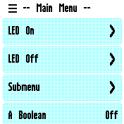
Second test with two sizes:
function toFontStr(s) { var fontImg = Graphics.createImage(s); return String.fromCharCode(0,fontImg.width,fontImg.height,1+128,0)+fontImg.buffer; } var fontStrS = toFontStr(` XX XXXXX XXXXX XX XX XX XX XX XXXX XXXXXX XXXXXX XX XX XX XX XX XX XX XX XX XX XX XX XX XX XX XX XX XX XX XX XX XX XX XX XX XX XX XX XX XX XX XX XX XX XX XX XX XX XX XX XXXXX XXXX XX XX XXXX XX XX XXXX XXXXXX XXXXX XX XXXXXX XXXXXX XX XX XXXXXX XX XX XXXXXX XXXXXX XXXXX XX XX XX XX XX XXXXXX XX XX XX XX XX XX XX XX XX XX XX XX XX XX XX XXXXXX XX XX XX XX XX XX XX XX XX XX XX XX XX XX XX XX XX XX XX XX XX XX XX XX XX XX XX XX XX XX XX XX XX XX XXXXXX XX XX XX XX XX XX XX XX XX XX XX XX XX XX XX XXXXX XX XX XX XX XX XX XX XX XX XX XX XX XX XX XX XX XX XX XX XX XX XX XX XX XX XX XX XX XX XX XX XX XX XX XX XX XX XX XXXXXX XXXXXX XXXXXX XXXXXX XX XX XXXXXX XX XX XXXXXX XX XX XXXXXX XXXXX XXXXX XXXXX XX XX XXXXX XX XX XXXX XX XX XXXXXX XXXX `); var fontStrL = toFontStr(` XXX XXXXXX XXXXXX XX XX XX XX XX XXXXX XXXXXXX XXXXXXX XX XX XX XX XX XX XX XX XX XX XX XX XX XX XX XX XX XX XX XX XX XX XX XX XX XX XX XX XX XX XX XX XX XX XX XX XX XX XX XX XX XX XX XX XX XX XX XX XX XX XX XX XX XX XX XX XX XX XX XX XXXXXX XXXXX XX XX XXXXX XX XX XXXXX XXXXXXX XXXXXX XX XXXXXXX XXXXXXX XX XX XXXXXXX XX XX XXXXXXX XXXXXXX XXXXXX XX XX XX XX XX XXXXXXX XX XX XX XX XX XX XX XX XX XX XX XX XX XX XX XXXXXXX XX XX XX XX XX XX XX XX XX XX XX XX XX XX XX XX XX XX XX XX XX XX XX XX XX XX XX XX XX XX XX XX XX XX XX XX XX XX XX XX XX XX XX XX XX XX XX XX XX XX XX XX XX XX XX XX XX XX XX XX XX XX XX XX XX XX XX XX XXXXXXX XX XX XX XX XX XX XX XX XX XX XX XX XX XX XX XXXXXX XX XX XX XX XX XX XX XX XX XX XX XX XX XX XX XX XX XX XX XX XX XX XX XX XX XX XX XX XX XX XX XX XX XX XX XX XX XX XX XX XX XX XX XX XX XX XX XX XX XX XX XX XX XX XX XX XX XX XX XX XX XX XX XX XX XX XX XX XX XX XXXXXXX XXXXXXX XXXXXXX XXXXXXX XX XX XXXXXXX XX XX XXXXXXX XX XX XXXXXXX XXXXXX XXXXXX XXXXXX XX XX XXXXXX XX XX XXXXX XX XX XXXXXXX XXXXX `); var menu = { "" : {title : fontStrS}, "Old Hello" : function() {}, "Old Hello when small" : function() {} }; menu[fontStrL] = function() {}; menu[fontStrS] = function() {}; E.showMenu(menu);- the large one is more readable now (moreso that the original 'normal' font)
- the lack of rounding is more apparent - maybe the corners would need smoothing out
- at least the two fonts look like they are the same typeface
1 Attachment
- the large one is more readable now (moreso that the original 'normal' font)
-
• #10
I like the sound of new fonts, particularly a nice range of sizes. typically I use the Vector font, it's easy to use for large sizes though not as good for small text. It would be nice to have the option for Bold text too.
Just for reference, here is the font that the Pebble watches used, and the reason they used it:Raster Gothic Condensed is the font used throughout the Pebble system, largely because it is optimized for monochromatic displays. Pebble selected this font because it allows a relatively large number of characters to be displayed on a single line, also because the font has an excellent readability vs. size ratio.
This is a paid for font, but the Rebble team has had a go at making a similar font and releasing it on Github: https://github.com/pebble-dev/renaissance
Unfortunately the fonts are only in pbf format, which I would try, but can't get to convert using the Espruino Font Converter. Does anyone know how I could get these fonts into the Bangle?
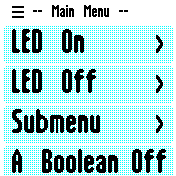
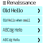
EDIT: Manually pasted the letters as Gordon did above, the bottom 2 rows are Renaissance 24 and Renaissance 18.
1 Attachment
-
• #11
Thanks! That is very interesting indeed! I think that's the only bitmap font in useful sizes I have ever seen! (apart from https://github.com/Tecate/bitmap-fonts - but those tend to be too small)
There does seem to be some documentation about the font format at https://github.com/pebble-dev/wiki/wiki/Firmware-Font-Format but actually the most useful seems to be the textual source files: https://github.com/pebble-dev/renaissance/blob/master/files/renaissance_18.pbff
I just bodged something up - this is what 18 bold looks like:
... code removed - see attached files below -
• #12
I just bodged something up
Fabulous, thanks Gordon! Your bodges look like finely honed works of art next to mine!
At first glance these look promising, some of the characters have gone a bit wonky, but very readable in the emulator and on a JS2.
Using an existing font has got to be easier than designing a new one (or multiple for different sizes) from scratch, question is are we happy to do that?
Also, is it possible to adjust the spacing between letters? When I made the mockup above I thought it was much more readable with just an extra pixel of space between each letter.
2 Attachments
-
• #13
Ahh, thanks - yes, it seems
T/others had a space before one of the lines that I wasn't expecting. I actually found https://github-wiki-see.page/m/pebble-dev/renaissance/wiki/PBFF-Format-description which explains it - I've fixed it now.It looks like the pebble font format allows characters to actually overlap, which we don't handle yet. So there's a bit of a question I guess about whether we use it as an opportunity to improve the font rendering/format as well.
Using an existing font has got to be easier than designing a new one (or multiple for different sizes) from scratch, question is are we happy to do that?
Definitely true! Well, assuming there are no legal problems I feel like the font itself looks better than my attempts so could be a good idea. I don't see an explicit license there so if we decided to go that route I'd have to contact the author - but it looks from what he's written in the README that he'd probably be fine with it.
is it possible to adjust the spacing between letters?
Right now that's up to the font converter, so yes it could be tweaked - however one of the reasons for changing font was to have something narrower (getting enough text horizontally is always an issue), so if we could get away with 1px space I think that might be preferable.
-
• #14
28px
1 Attachment
-
• #15
18px bold:
1 Attachment
-
• #16
It definitely feels like an improvement...
The only gotcha is 28px is the maximum size we have a font for, but we could get 36px by 2x upscaling the 18px font (we'd probably want to use the non-bold one for that)
edit: I just dumped the code I used in https://github.com/espruino/Espruino/tree/master/libs/graphics/font
1 Attachment
-
• #17
Quick update, I just heard back from Jay Neubrand who made the font, and he's more than happy for it to be used in Espruino and has added a very permissive license to it.
Personally, seeing it in the menu above it feels clear to me it's a huge step up from what we currently have. I might have liked the capitals to be a bit more narrow, but beggars can't be choosers :)
So now I guess the questions really are:
- Do we just include the font using the standard mechanism, or do we take the opportunity to have a new font format and render different size glyphs for each character (which should be more efficient with space and speed). If we did it right, we could allow 'font files' which might make life a lot easier in the future, and maybe even support unicode. It would be good for Bangle.js 1 as well - right now we may struggle getting all the new fonts in internal flash.
- How do we make the fonts accessible? Sure, we could just have
ren14/ren18/ren24andren28fonts, but I think we should maybe just allow someone to dosetFont("30px")and get the nearest font that fits within 30px height... Or maybe the ability to do.setFont("smaller")to go down just one font size... - How do we actually implement the above so that you can upload a new 'font pack' to your Bangle and have all the fonts change?
There's quite a lot to think about there unfortunately :(
- Do we just include the font using the standard mechanism, or do we take the opportunity to have a new font format and render different size glyphs for each character (which should be more efficient with space and speed). If we did it right, we could allow 'font files' which might make life a lot easier in the future, and maybe even support unicode. It would be good for Bangle.js 1 as well - right now we may struggle getting all the new fonts in internal flash.
-
• #18
A new font format seems interesting, especially if you could add e.g. emojis.
I don't get how it would be smaller than indexed bitmaps though?
Edit: oh, variable width and just a \n after the last black pixel per line would help.I guess sometimes you still want to pick an exact font, for e.g. clock layouts? Maybe add
Bangle.selectFont(size), and it gives you the best font to use for that size? Custom "font packs" could then override that function.
Seems a bit clunky thoughg.setFont(Bangle.selectFont('30px'));:-( -
• #19
I think the Renaissance font looks very nice and well readable. Having a way to get a font fitting into a given height would be great for layouts for both B1/B2 since something like
setFont(g.getHeight()/5)could just work. Something like that would even be future proof if an even better matching font is added later (e.g. 30px wanted, 24 available, 28 added later). That would be great for replacing fonts system wide or making them a property of the theme.setFontwith number as parameter could be used to find a matching font while string as parameter denotes a specific font directly as it does now.As for the different width glyphs I think that would be very beneficial for rendering more text. The problem of watchfaces or similar stuff could be solved by having
setFontMono(bool)which would cause the font rendering to use the max width of all glyphs and and center the glyphs on render. Another way would be just working around that problem by rendering single characters in the app. Probably good enough for the time on watch faces. -
• #20
I don't get how it would be smaller than indexed bitmaps though?
It's not just variable width, but variable height too since virtually no characters fill the whole area.
Maybe add
Bangle.selectFont(size)A new function is a great idea! And then we can provide a polyfill for older firmwares.
I was a bit concerned about having to polyfillsetFontand it hurting performance.Potentially we could just have
g.setFontSize(...)instead. To get a selected font you could always dog.setFontSize(...).getFont()setFontMono(bool)
That's a good thought - and not too hard to do. I had been wondering about how to do monospaced fonts nicely...
I guess there's a question about whether we try and have
setFontSize/whatever it's called be smart enough that you could sayg.setFontSize({text: ..., width: 170, height:100, min:14, wrap:true})and it'd try and find a font that would display the given text in the area. It might be good for messages... -
• #21
setFontMono(bool)That seems like a good idea (maybe also add
setFontMono(int width)?)g.setFontSize(...)That looks good. (and font packs could override
Graphics.prototype.setFontSize)try and find a font that would display the given text in the area. It might be good for messages...
On the one hand: that seems overly complicated. I think messages should just use a fixed size and handle overflow: that will happen anyway, and showing short messages in a larger font doesn't seem worth the hassle. (with variable character size, I think we'd need to "try all sizes until one fits", not sure that is a good idea¹)
On the other hand: if authors really want to use it, we don't want apps to "roll their own" if Bangle could do it for them.¹ even though I wrote that code myself, regretting it now 😉
-
• #22
Great news that the font is available with a 'very permissive' license (having read the license I see why you didn't spell it out here!) Very glad to see that others also think Renaissance would be a suitable font.
I don't know enough about how Espruino works with fonts to comment on a new font renderer, or packaging. Since some of the Renaissance fonts are bold though it would be nice to be able to use that. Since they're already packaged up as PBF files could we use them directly? Would people be able to make new fonts in the same format?
In terms of how we use the fonts, I'd be happy specifying the font and size directly, especially if there was a wiki page or tutorial with examples of the different fonts and sizes. Alternatively listing them as
tiny,small,mediumandlargewould be quite user friendly, but I think having the size in the name is more useful.I really like Gordon's idea of working out the best size of font to fit the text in a space, I agree it would be great for messages. I'm actually less keen on letting the Bangle pick the 'best' font size in other situations though, I already find it slightly odd that menu items can have 2 sizes of font, I can imagine some very strange looking screens with multiple different sized bits of text looking very messy.
-
• #23
Since they're already packaged up as PBF files could we use them directly?
I was wondering about that. It feels like maybe it's not as compact a format as it could be (even our naively stored 28px renaissance font is 8.5k, whereas the pbf is 10k), but maybe that doesn't matter if a lot of the time it'll be in external flash anyway. It does handle non-ascii chars though which is potentially very useful.
I'd feel happier if there were a bunch of tools out there for working with the format, but it doesn't seem like there's a great deal at the moment... So I'm still on the fence a bit.
Maybe for the size picking, we just make that code a library for now if it is needed at all, and then see if it gets used a lot?
-
• #24
I did some experiments with replacing fonts in the run app and the menu and using the pebble font. See https://github.com/espruino/BangleApps/issues/3109
Maybe it would be better to discuss it here?
One issue with the pebble font is that it has much top spacing:
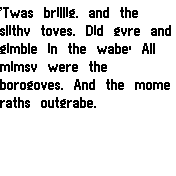
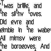
- For example the glyph "G" (like in "GPSS" in the left screenshot) in espruino's 6x8:2 has a visible height of 12 pixels and 2 pixels space at the top an bottom. That's a ratio of 3:1.
Using the pebble 18 bold font it's visible height ist only 11 pixels (the right screenshot) and a top space of 7(!) pixels. Giving a much worse ratio of 1.5:1
// 7 pixels top spacing


#####
#######
##   ##
##
##
##  ###
##  ###
##   ##
##   ##
#######
######
What do you think?
To me it looks like we couldn't use the fonts like they are. It should be possible to remove the high glyphs and only use the characters of e.g. the 6x8 font and move the regular glyphs up. I think it could be automated. Otherwise it would be lot of work.
1 Attachment
- For example the glyph "G" (like in "GPSS" in the left screenshot) in espruino's 6x8:2 has a visible height of 12 pixels and 2 pixels space at the top an bottom. That's a ratio of 3:1.
-
• #25
Here I am using the 24 bold font for "GPSS", etc and removed the top spacing. It looks much better than the original one and might also be better readable.
But the largest available pebble font, the 28, has only a visible size of a 20/22 font. That is too small. Maybe we could talk to the author if he would create some more sizes...
Edit: I did a little experiment and doubled glyphs from the pebble 18 font using nearest neighbour. And then adjusted the edges using the 28 size as reference. Would be some hours of work but I think it should be possible to create a 36 size version.
1 Attachment
 Ganblejs
 HughB
HughB Gordon
 rigrig
 Sir_Indy
 halemmerich
 Chriz
Chriz

Hi!
I've just been having a quick play at trying to sort out the font situation on Bangle.js.
Basically, it's almost impossible to get a bitmap font in the same style and different sizes, so right now we have different types of fonts for each size, and it doesn't look great. Many folks seem to resort to just upscaling 6x8 to a bigger blocky font.
It was suggested before that a font could be upscaled, and I thought I'd give it a try with the AdvMAME scale algorithms:
This isn't ideal, but it seems like it could be a possibility - specifically if I made a custom font in higher detail than 6x8 (maybe 8x12) then that would likely upscale a lot better, and we could have acceptable quality 12, 24 and 36 pixel high fonts in the same style.
Any thoughts?