-
• #2
That setting is for when the watch is disconnected from your phone, IIRC.
-
• #3
As @johan_m_o says, it's when the app is disconnected.
Please can you take a look at the
Read more...option for apps first if you have questions like this? This one's already clearly explained in the Android app https://banglejs.com/apps/?q=android and when you asked about what the messages icons did a few days ago, they were all explained in the messages app docs too. -
• #4
My apologies Gordon I should have read the README file.
I'm feeling frustrated with the Meesages App.
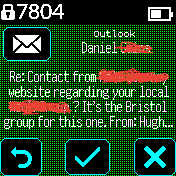
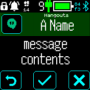
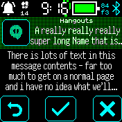
. 2/3 of the screen space to read a message is sacrificed to the HEADER and the BUTTONS.
. The initial font is tiny and unreadable
. You have to change to the full screen mode to be able to read and scroll.
. The colour scheme makes it harder to read
. There is a right offset problem with the touch screen coordinates
which means pressing ok first time is 50% of the time a miss.
http://forum.espruino.com/conversations/371867/#comment16406025
. Put 3 buttons into this (even when spaced apart) and good luck pressing the right one.
http://forum.espruino.com/conversations/373167/#comment16408868
. The 3 buttons are really an unnecessary complication and could be avoided by simpler UI design.Definitions:
Messages - are SMS, text, WhatsApp, short telegrams messages from people.
Notifications are 'your phone battery is running low'It seems the current design is more orientated to managing notifications than messages.
The AmizFit Bip does this really well (actually much better than more expensive watches, eg GTS 2).
. Message pop up is instantly readable in a highly readable font and scrollable - you just swipe down
. At end of message scroll down to next in the list of messages
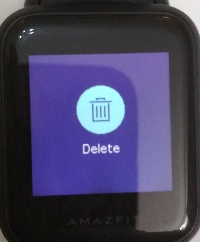
. Swipe left to get the dialogue to delete the message
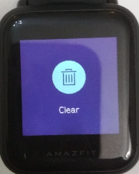
. At the end of the list there is a Clear button that deletes all the notifications (if you wish).
Or Button (back to exit to clock at any point).I never had to learn any of this (though I did read the manual) - it was intuitive from day 1.
The design principles are.
. Screenspace is prioritised towards the text of the message not the user interaction.
. Messages are deleted by the user by a deliberate user choice.
. Single button for a single action, easy to touch, no fat finger or coordinate offset issues.
. Restricted use of color / dithering to aid readability
. Single highly readable small font (its about 15px but extremely clear)Its been a few weeks since I last tried to use the messages app. So I spent a couple of days trying it
out again. I have tested with the send debug menu in GadgetBridge and sent myself a few messages
and it seems to work reasonably well. But today I used it in the real world and found I would get a
WhatsApp message, fumble to touch the read full message button, find I have exited the app and
then see the dialogue that says 'no messages' when I go back into Messages.I know you are working hard on Bangle 2 and cant do everything so hope you dont take
this personally. I love the B2, it just gets better. So apologies if my frusration with the
messages App sounds a bit ranty.I guess we need someone to take this app on and champion it.
4 Attachments
-
• #5
I'm feeling frustrated with the Meesages App.
Yes, I noticed that ;)
Are you using the latest messages app? At least I see the attached which is slightly more readable (background colour on the body is different)
One big issue I see is the font. Right now we really don't have any decent 'intermediate size' font option - the 15px high font is half the height of the 20px font - and I think changing that would make a big difference. It's something I want to get sorted very soon, but I want to fix it properly - so the same font style, but in different sizes - and it's proving difficult to find something.
I have however just made a change to make it try a medium-size font before defaulting to the tiny font, and you can now configure how small it goes in settings.
Totally agree on the color - but then we don't have the luxury of a 6bpp screen like the bip, so it's slightly harder. I have just changed it to use the current theme, so now changing the theme colors is easy.
As I'd mentioned in the other threads, I really don't approve of swipe/touch interaction when there's no onscreen hint, but adding something tiny right at the bottom as a hint would be neat. I'm in the process of adding a more generic method of getting a 'back' button so I think when that's in, we can use that (so it matches other menus), and then adding swipe will actually remove the need for all other buttons.
2 Attachments
-
• #6
I like the idea of getting rid of the buttons and just swiping to show one big button to confirm message deletion, we could add a tiny arrow/icon at the side of the screen to make it discoverable.
What I really think it needs is instead of "tap to open long message texts in the scroller", just making the whole screen scrollable. Again with a small indicator at the bottom, or maybe just make long texts end up with the bottom half of a line cut off.
-
• #7
I like the idea of tapping anywhere on the screen, or swiping in any direction, to bring up a simple set of buttons that would allow you to delete, go back, etc. But the messages themselves would take up the whole screen in a readable font.
I have the biggest problem while driving. If I receive a message, I need to be able to see it at a glance, without tapping anything, opening menus, etc. It should be readable straightway.
I really do love my Bangle watch, and it is getting better all the time. Thank you all for your contributions.
-
• #8
I also think the action buttons should be moved to a separate screen.
The way I see it:- An incoming notification is displayed fullscreen.
- If text overflows, swiping up/down should scroll it
- Right to left swipe brings up the actions window
- Left to right dismisses/goes back to previous screen
The "actions window" would either be the existing buttons arranged in a grid, or something like "the new menu system" at http://forum.espruino.com/conversations/372830/ - with symbol + text label for each action.
- An incoming notification is displayed fullscreen.
-
• #9
Well, I've started on a largeish improvement.
It works*, but there is still much to do. Just figured I'd post here so someone else doesn't start duplicating my effort.
So far:- separate screens for messages/call/music/map
- scrolling messages, you can scroll down to the next message
- left-to-right swipe takes you back
- right-to-left on a message shows actions menu
* With the latest cutting-edge firmware, Bangle.js1 should in theory work, but not tested yet.
- separate screens for messages/call/music/map
-
• #10
Nice! Sadly I cannot test now, my bangle is broken (dead button) and I'm waiting for the replacement to arrive :-(
-
• #11
Probably late to the party etc.. but I am quite happy with the latest version in 'master' that is available from the official store now. The font resizes itself, music is scrolling. On the BangleJS2 that I use with the iPhone there are no other buttons than the back button, but for me it's working very very well. I also don't expect to read entire e-mails on the messages app. This is for notifications, not for lots and lots of text as I see it.
Anyway, I think I will try rigrig's version to test, looks pretty cool.
I do use the swipe-to-menu app which doesn't seem to compatible with swiping actions in other apps, I will remove that one -
• #12
Testing your fork a little. Have you considered left-to-right swipe in music submenu to not be 'up menu level' but instead 'previous track'?
Also, pressing the button in music submenu acts simultaneously to 'play/pause' and 'up menu level'.
And lastly, I suggest the music menu icon to be shown on app start even if no music is currently playing. This way you could access music controls to initiate a track from the bangle instead of from the phone.
My two cents! Nice work :)
-
• #13
Thanks for the feedback!
Music controls are tricky, because thesetUIstandard behaviour is for ltr-swipe and button presses to take you back, and I'm reluctant to make it different on just one screen. I guess it could be a setting, but I'm already a bit unhappy with the amount of settings as it is.Always showing the music icon feels like a lot of clutter for people who don't use it, and opening it would get you to an empty screen. And what will the phone even play if you tell it to start?
But I'll look into remembering music state (for some time) when you close the app, so the icon shows up if you used it recently. -
• #14
Good points!
Spitballing some other ideas:
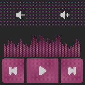
I've attached a screenshot of the music app on my Amazfit Bip developed by MNVolkov over at myamazfit.ru (translated to english). That layout with somewhat large buttons works really well on the Bip at least (same size screen, don't know if it's more accurate for touches or not). If one used that instead of LeftRight swipes it wouldn't interfere with setUI. I would probably still prefer UpDown swipes to change volume though, your implementation is really nice!Another one could be to have the music screen 'be to the left of' the message opening screen, making it accessible with a 'right-to-left swipe'. And then get back to opening screen with a 'left-to-right swipe', i.e using something like natural scrolling. The music icon could also take you there if/when it's shown on the opening screen.
edit: A more general thing I think the Bip does well, that I don't think is mentioned in previous replies here, is that it does away with incremental scrolling with drags in favor of 'scrolling' the whole screen with swipes. I.e more like moving between pages. I think this is more efficient in daily use. I like the new main banglejs menu system, but it's not as quick to navigate as the bip menus.
1 Attachment
-
• #15
That button layout works really well on the Bip at least
Buttons that size would work fine on the Bangle.js 2, but
1) tapping the whole screen is always much easier than hitting a button
2) Bangle.js 1 already uses the left side to goback(setUIagain), and hitting the middle might also be a bit tricky.Having actual buttons on screen is a lot clearer than having to figure out swipes though. I think I'll probably add those bottom buttons, but keep tapping anywhere else for play/pause and swipe-to-next still work.
Do people actually go "back"? I know it seems a logical complement to "next", but one of the reasons I didn't mind dropping it was that I didn't think it would get actual use.
edit: looks like
setUIactually doesn't handle swipes, so at least swiping "back" should be fine. -
• #16
Do people actually go "back"?
I don't know how many do. But I do it sometimes at least :p If I missed the beginning of a song, album or podcast for some reason I'll press 'back' to get back to the start.
-
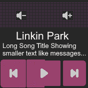
• #17
So far I think the music app could use some work in layout. I'll see about mocking some up, but basically I'm always missing the button targets as they are only directly on the buttons. If we could eliminate the borders and have the buttons take up the whole area where they are, I would be more confident that I hit it. Second would be is if we could make it vibrate when we press the button. I'd love that. Finally, I'd rather have artist and song show in a better way somehow.
-
• #18
Try the new touch screen calibration app and see if that solves your issues with the buttons.
http://forum.espruino.com/conversations/375618/#comment16518531
-
• #19
Hey All,
Slight change on the above poster's image. Take a look at the size of the left buttons, take up more space so that the touch targets are larger.
1 Attachment
-
• #20
Do people actually go "back"?
I often use the 'back' function when listening to music. Some songs I want to listen to several times, according to my mood.
I lack that functions at iOS music messages: back, loop 1 song, volume control.
-
• #22
Still working on this, but it's getting close to where I need to start worrying about how to add this to the official app store so it can live peacefully next to the existing
messagesapp.
I messed with theappid, so if you want to check it out you now need to uninstall yourmessagesapp, and then install "Scrolling messages" from https://bangle.tubul.net/?id=smessages -
• #23
Nice, gonna test it when I have the time!
I believe you need to change "prev" on line 348 of app.js to "previous"? Or does it work as it is?
-
• #24
Thanks, that was indeed broken, but I didn't notice because I never use it ;-)
-
• #25
It seems like in order for smessages to work correctly I have to first install messages and then smessages? Otherwise the app icon doesn't show up in the launcher and there's no entry for it in settings->apps. (I managed to access the music controls without first installing the original messages app though)
 johan_m_o
 Gordon
 HughB
HughB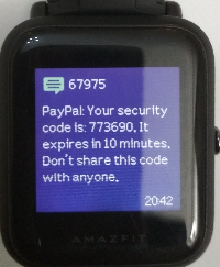
 rigrig
 user137198
 user138781
 Alessandro
 jeroenpeters1986
 Ganblejs
 fanoushs-punching-bag
 Serj
Serj ANonnyMoose
I'm using latest Android app messages app. I have keep messages =Yes in Android. When I get a message (say from what'sapp) I try to read it. If I accidentally hit one of the buttons and leave the message app then go back into the messages app it says no messages?
Am i right that I should see my message unless I deliberately deleted it?
I am using the new menu system so will need to check that the setting is correctly set in the json file. Can't do this at present.
Can anyone else confirm they can keep messages?