-
• #2
Hi, I liked the menu a lot!
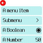
I only found the number editing a little bit confusing, as my instinct was to tap on the arrows, not to drag.
-
• #3
I only found the number editing a little bit confusing, as my instinct was to tap on the arrows, not to drag.
Thanks - that's a good point. I could always make tap work as well.
-
• #4
Much better. For example with current menu I'm constantly getting item-click when I just try to scroll, but this doesn't happen at all with this new menu.
-
• #5
Also does this mean there is only one kind of menu and not two kinds which is currently really confusing?
-
• #6
Looks nice, definitely a large improvement! (Still a few bugs, but I assume this is just the first PoC)
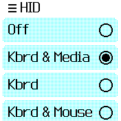
- true/false menu items are just a radio button
- multi-choice items pop up their own menu
I think that's the wrong way round: boolean items should have a checkbox, multiple choices radioboxes.
1 Attachment
- true/false menu items are just a radio button
-
• #7
I love it. Not 100% sure about going back. I think more aesthetically than practically.
The numbers work as I personally expected - I had been wondering about modifying the alarms app to be like that because I find it fiddly at the moment, but if you're changing the menu system like this then it is covered!
The only thing I miss from the current menu system is the tap anywhere to activate the highlighted item. I am clumsy with touchscreens and it is a feature I really appreciate. Only thing as previously mentioned is that I currently find the scroll direction backwards.
Oh, I agree with @rigrig that a boolean should be a checkbox, the radio confused me.
But I would keep the multiple choice as is.edit: looked again and on second thoughts, completely agree with @rigrig on that -
• #8
+1
boolean items should have a checkbox! -
• #9
I think that's the wrong way round: boolean items should have a checkbox, multiple choices radioboxes.
Yeah, it should be a checkbox (or switch icon) so when there are >1 it's not confusing. I'm not sure if it's worth using the extra space to show radio buttons for multi-choice items? You won't ever see them change, but I guess it does show you what was previously selected?
Also does this mean there is only one kind of menu and not two kinds which is currently really confusing?
You mean launcher vs. in-app menus? If so, yes-ish - they will both behave the same way at least.
The only thing I miss from the current menu system is the tap anywhere to activate the highlighted item.
Yes, I'm not sure there's an easy way around that with this design - I think most people will expect to be able to tap on the item they are interested in. It should be pretty easy to modify it later to highlight the 'middle' item and have tap to select though, so it could always be a new app.
-
• #10
I'm not sure if it's worth using the extra space to show radio buttons (...) I guess it does show you what was previously selected?
It also shows that you are looking at a list of options instead of a submenu. Although I guess that becomes clear soon enough when you pick one. (And in theory you could know the difference because it was showing a value)
-
• #11
https://www.espruino.com/ide/?gist=0aac0c7a020913a0f162571d9d3b1ee6
Choose 'RAM' and upload it to your Bangle.js 2 for testing yourself.... doesn't work any more: "// Error loading Gist 0aac0c7a020913a0f162571d9d3b1ee6"
... still works. -
• #12
Looks neat! Numbers edit is perfect.
In emulator I cannot feel a feedback like buzz (BTW can buzz be added to emulator? as a sound or as a some visual). Will load this to watch.
May be it needs a highlight to know which item I will tap.Editing for special types, like for time, date and color would be nice to have.
Also callbacks that allow to custize, like a callback like itemDraw(x1,y1,x2,y2) to customize drawing. May be it is already there, I just do not know.I've added this to current settings menu. Having issues with Git to merge and create pull request. But it looks like, if we go with the new menu, the modification of the old one does not make a sense.
-
• #13
Cool!
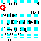
I would add a small icon to make clear that there is a submenu.
1 Attachment
-
• #14
Good idea!
-
• #15
To avoid overlapping of strings what if we put the menu name in top left and its value in bottom right?
2 Attachments
-
• #16
I would add a small icon to make clear that there is a submenu
Yes, that sounds like a great idea.
To avoid overlapping of strings what if we put the menu name in top left and its value in bottom right?
It's a thought... but then you have smaller fonts even when you don't have an overlap? Wrapping the right-hand side if it goes over halfway across the page could be a good start
-
• #17
You mean launcher vs. in-app menus? If so, yes-ish - they will both behave the same way at least.
I meant that top launcher menu (Messages, Android, Settings, About, ...) is different than submenus (e.g. Settings submenu).
That is confusing and also the submenus don't work that well: I often get item-click when I meant to scroll.
-
• #18
Updated with some of the suggestions in...
-
• #19
Nice!
-
• #20
I like it!
-
• #21
So my first thought before I tried it was, is it using on('drag') or on('touch'). I find any App that has used on drag almost impossible to use.
I then tried it in RAM to get the feel on the Bangle and thought, this looks really nice, But I found it very unresponsive. I then looked at the code and saw it was using on('drag').
I'd love to use this style of menu, but sadly would be screaming with frustration after pressing something and not getting any response.
Any chance it could be implemented using on('touch') ?
-
• #22
I like it!
My Amazfit Bip S does a little trickery to fake smoother interaction than it is probably actually capable of. It always "scrolls" the same amount of menu options (one page), triggered by swiping, but independent of swiping speed. So the rendering is not directly dependent on touch interaction. The scrolling animation is short to hide that you can not "stop" scrolling, but it is a very convincing effect if you do not try to scroll very slow or extremely fast in different directions. -
• #23
Any chance it could be implemented using on('touch') ?
I don't understand what you're suggesting here... The menu uses the
dragevent when you drag your finger, because that's the only option if you want to drag. Then it usestouchfor selecting menu items. It's exactly the same as the Launcher.@halemmerich I quite like being able to scroll to exactly the right place, but I think there are some things we can do to improve the rendering performance on Bangle.js 2, so at some point it will get smoother.
-
• #24
This is looking really nice so far. How would it be if a swipe right was a "back"?
-
• #25
Maybe it's me but all I can do with this is scroll it up and down. Touching or tapping on a submenu has no effect
 diego
diego Gordon
 malaire
 rigrig
 myownself
 uname
uname HilmarSt
 Mark_M
 Alessandro
 Serj
Serj

 RaoulDuke
 HughB
HughB halemmerich
 andrewg_oz
Hi!
I've been experimenting with a new look and feel for the built-in menus. I'm interested to see what you think...
https://www.espruino.com/ide/?emulator&upload&gist=0aac0c7a020913a0f162571d9d3b1ee6
Click the above then choose 'Bangle.js 2' as the emulator. You could also just go to:
https://www.espruino.com/ide/?gist=0aac0c7a020913a0f162571d9d3b1ee6
Choose 'RAM' and upload it to your Bangle.js 2 for testing yourself.
Any thoughts? I feel like this will probably improve the look of Bangle.js apps a lot.
1 Attachment