-
• #2
I'd like to take a stab at the font design. Is there an average number of points per character I should try to target?
As an aside, the work MaBecker's been doing on Hershey fonts looks pretty darn nifty. That would definitely be the better looking solution if it can be made performant enough.
-
• #3
That would be awesome!
Well, the current vector font averages ~30 points each for the 95 available characters. If we could do that it'd roughly halve the size, but hopefully we could get a bit under.
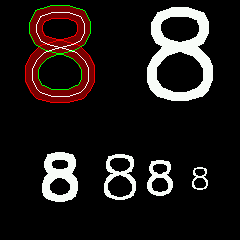
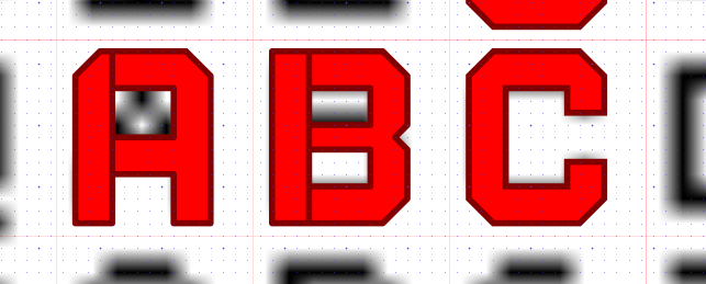
Just a note about making the fonts after sleeping on it - actually what I've done for holes in the SVG above (using one poly and going across and back to make a hole) probably isn't the best and it's a pain to work with. I think it'd be better to just use two polys and when possible try and get them so that each polygon didn't turn into multiple scanlines (eg.
Eis better thanW).I'm a bit on the fence about Hershey - maybe the performance isn't too big a deal. The issue IMO is when you get to the middle-ground of 2px wide lines where it'll look quite rough using a filled polygon. Higher sizes can be made to work well.
If you're interested I had a quick go at Hershey rendering by mapping the line into one big polygon: https://github.com/espruino/Espruino/issues/1702#issuecomment-627833095
I guess that could be an option - there are still a few edge cases to work out on it though.
2 Attachments
-
• #4
Well, the current vector font averages ~30 points each for the 95 available characters. If we could do that it'd roughly halve the size, but hopefully we could get a bit under.
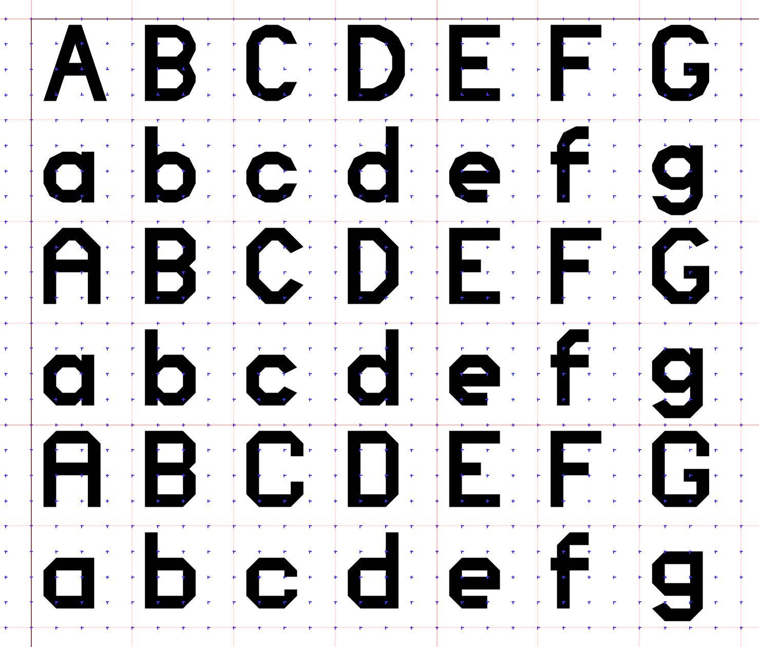
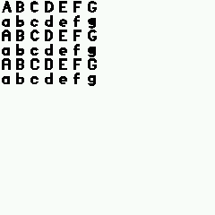
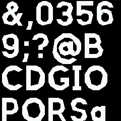
I made some sample characters in a few different styles. The top two rows are as smooth as I could manage given the limitations of the grid, averaging 20 points per characters. The next two rows are a bit more angular, averaging ~17 points per character. The last two rows are as minimal as I could manage, averaging ~15 points per character.
I'd be personally inclined to go with the first style, since it scales up nicely and still stays significantly under the ~30 points per character of the original font, but I'd be curious to know what other people think.
(This is using the single poly per character method - if I break it up into multiple polys that'll inflate the point count a little bit)
2 Attachments
-
• #5
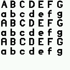
And here's the above characters rendered on the Bangle.js, using my svg2bangle tool. At 2x scale they generally look pretty good, but at 1x scale it gets a bit quirky. Part of the issue is that fillPoly doesn't preserve symmetry - the same pattern of points doesn't produce the same pattern of pixels when mirrored vertically or horizontally.
Here's the emulator link: https://www.espruino.com/ide/emulator.html?gist=c6dcac546c7247108f7c2255251d6c03
I'm a bit on the fence about Hershey - maybe the performance isn't too big a deal. The issue IMO is when you get to the middle-ground of 2px wide lines where it'll look quite rough using a filled polygon. Higher sizes can be made to work well.
On the flipside, with the hershey fonts people can always tweak the line thickness until it looks good to them. With a regular poly font you get no such freedom.
2 Attachments
-
• #6
Wow, thank you! Those look awesome!
Yes, personally I prefer the first option too...
fillPolyis definitely going to have to change at some point because of that scanline issue that was posted up, so I might see if I can change how well the rendering works there.I guess from my point of view if you were willing to put in the huge amount of work to do nice fonts, this would be a nice easy way of improving vector fonts as it basically slots into what's there already. It'd be faster too.
The Hershey stuff is still going to take a bit of work to get rendering correctly, but I guess it might be more flexible when it's done? It'll still need a bunch of work (export to SVG then re-import) to add some missing symbols too.
-
• #7
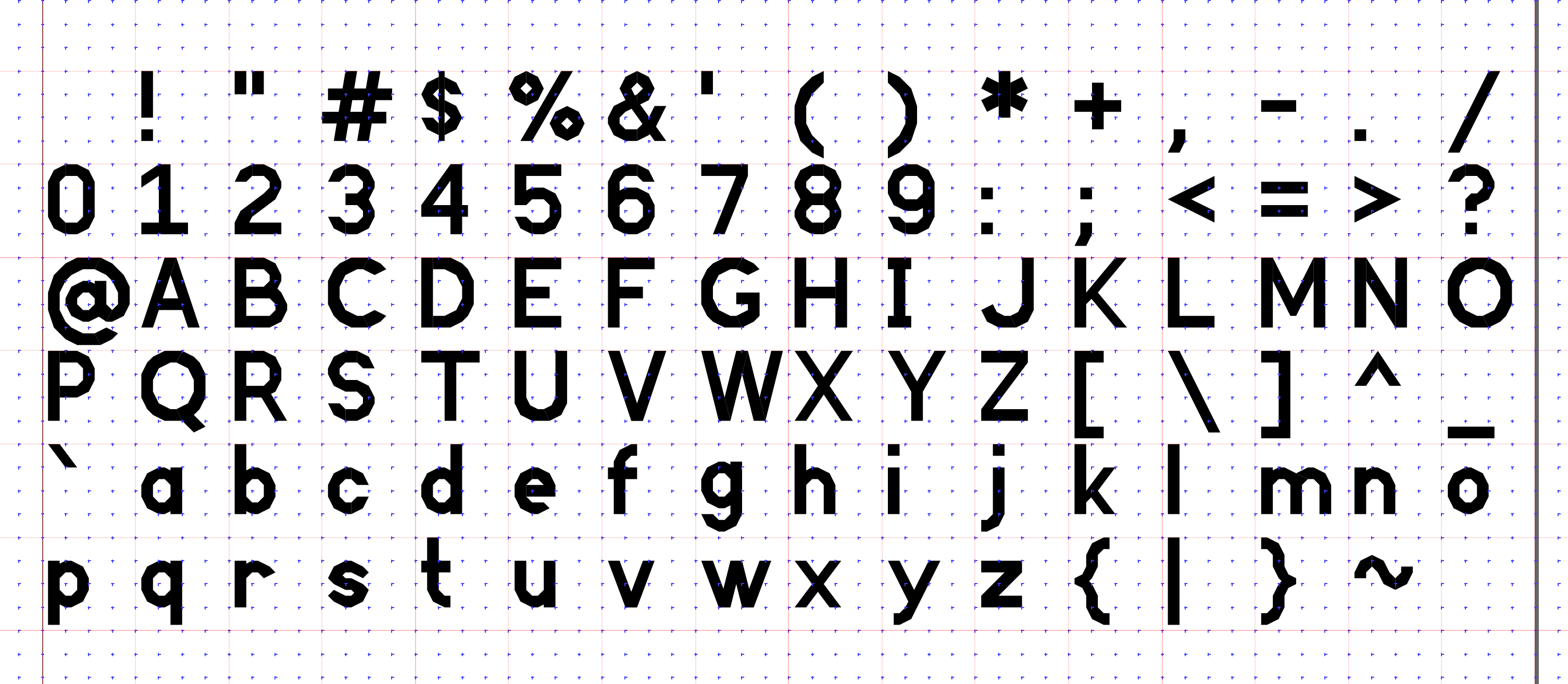
Here's my go at the full font, covering the ASCII range. I tried to break things up in such a way as to avoid the scanline issue, so there's more individual shapes than would otherwise be necessary.
Let me know if there's any modifications or additions you would like me to make :)
2 Attachments
-
• #8
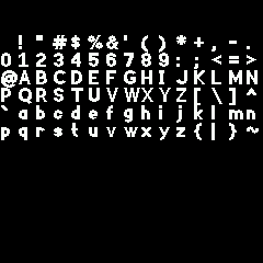
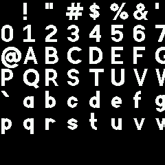
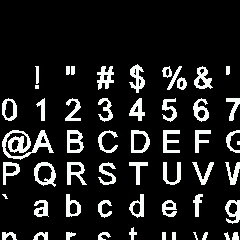
And for the sake of completeness, here it is rendered in the emulator.
I doubt the 1x scale results are ever going to look quite as good as a handcrafted pixel font, since the rasterization algorithm has to deal with things like pixels that are perfectly subdivided by an edge. That said, I think it'll definitely look better if fillPoly can be improved. Some notable quirks:
- The top bar of letters like E, F, and Z are one pixel thicker than they should be
- There should be a 1 pixel gap between the two marks in the double quote, but it comes out looking like a solid block
- You get can get notably different results from some shapes just by reversing the order of the points (this is the difference between the two bars of the uppcase K, for instance)
The 2x and up results look pretty good, though, which I assume is the more important use case.
3 Attachments
- The top bar of letters like E, F, and Z are one pixel thicker than they should be
-
• #9
Wow, those look absolutely amazing - thank you! I'll see about pulling that in to Espruino.
The poly rendering is difficult - it seems for most graphics work you fill up to the top left pixels, but then one pixel in on the bottom right (to stop overdraw when two polys touch) but I'm not sure if that's actually what we want, as I'm pretty sure when I tried it the result was pretty bad.
edit: filed an issue for it at https://github.com/espruino/Espruino/issues/1824 so I remember to get this done very soon. Most of today is going to be spent packing Bangles I'm afraid!
-
• #10
Very smoth - great job @NebbishHacker!
Can you please add some additional chars like
$€äöüÄÜÖß°? -
• #11
There was a bit of a discussion on https://github.com/espruino/Espruino/issues/1702#issuecomment-627892058 about hard-coding the extra characters - basically just have a bunch of stuff that goes above the letters.
I'm happy to have a poke around at those though. I could re-use the same mapping to handle the lack of chars in the default 4x6 font too.
What do you think we should do about defining the width of each character? Maybe if I add a vertical red line in the SVG by each character or something like that, I can pick it out when generating the font file.
-
• #12
The poly rendering is difficult - it seems for most graphics work you fill up to the top left pixels, but then one pixel in on the bottom right (to stop overdraw when two polys touch) but I'm not sure if that's actually what we want, as I'm pretty sure when I tried it the result was pretty bad.
I think that's exactly what you want in this case, where you have shapes you want to be able to scale up and down without affecting their proportions. Including the bottom right pixel effectively makes things a pixel larger than they should be, which can be a big difference at small sizes.
It might help to think of the coordinates as specifying grid locations between the pixels, rather than the pixels themselves.
-
• #13
I think special casing the diacretics makes a lot of sense, especially since I didn't leave enough space above the letters to fit them in properly. 😐
For the width of each character, could you just find the rightmost point and base it on that? Although I guess that would mean hardcoding the width of the space.
-
• #14
For the width of each character, could you just find the rightmost point and base it on that? Although I guess that would mean hardcoding the width of the space.
Yes that would be nice and handle exactly what's needed for other languages as well.
-
• #15
could you just find the rightmost point and base it on that?
Yes, totally - that would be easier if it worked out ok. It'd save a bunch of space too.
-
• #16
New vector font is now in a branch at https://github.com/espruino/Espruino/compare/new_vector_font?expand=1
I still have to fix the font scaling, but it looks amazing - and takes up 1/4 of the memory!
Thanks @NebbishHacker - this is amazing. Can't wait to get it into the Bangle.js firmware :)
-
• #17
Great, will give it a try .
and takes up 1/4 of the memory!
Do you mean compared to the existing vector font?
-
• #18
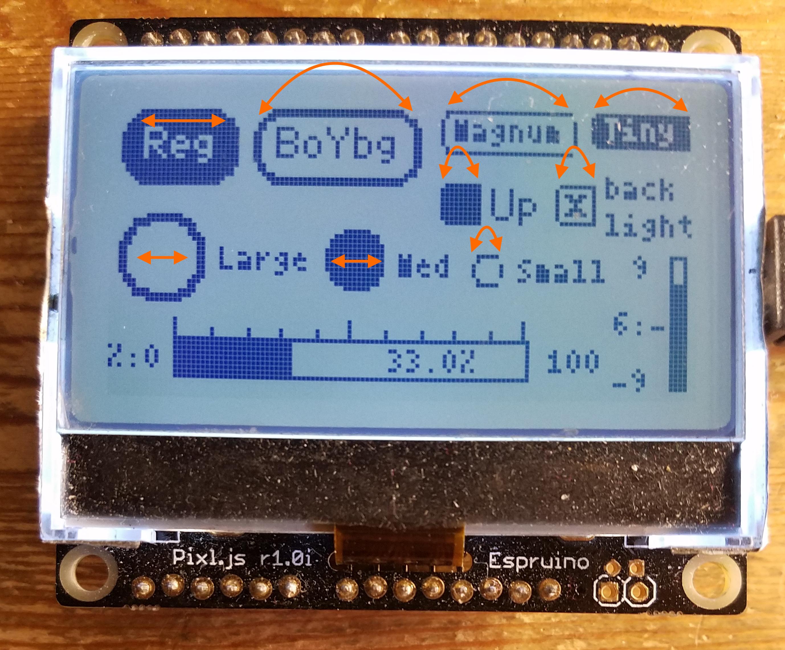
I'm still milling in my head the fill poly issue. It is about rounding when it comes to low resolution - like in pixlejs. In non-graph-math language, it matters where the last point was relative to the new point and what the x/y delta is and the absolute pos in the (max) grid for the character. My gut then tells me that there is no general rule that can be right since character / symbol recognition by human is not following how math would simplified do... it depends on the symbols the reader knows and is trained to read even when not perfectly shaped or only partially visible / printed (I experienced that myself in recognition training in armed forces... and you may have noticed that to: for example, if you are into cars, you do not need to see much of a car and you know exactly what make and model - and even year - the care is you 'see'). In the font world think about the the 2x3 numeric font... it work for the digits 0..9, but if it would have to work for hex 0-9a-f, it fails for humans, even there is 64 (63) combinations 2 power number of dots|bits (-1) available. I tried to make some of the chars in 4x6 fonts better recognizable, like the & and the @ which show the most lines in x or y direction, for which there is not enough pixels to separate the lines.
The issue with fill poly is though not down to a few pixles. I tried to draw a beveled rectangle - a poly with corners beveled and then also rounded (2..3 bevels - with different angles - so to speak) on pixlejs, What bothered me that even with rounded and correct data, either the x max or min or y max or min corners would not render the same way. Just drawing - not filling - which happens with 1 pixle wide lines works perfect / create perfect corners - perceived 45 degree beveled or rounded (2 or 3 lines w/ different angle). To see yourself what I mean, take a look at [post #5(http://forum.espruino.com/comments/15012813/) in conversation titled g.fillPoly bug? for about 5 months ago (pic repeated below).
1 Attachment
-
• #19
I agree that there is no general rule that will always feel "right".
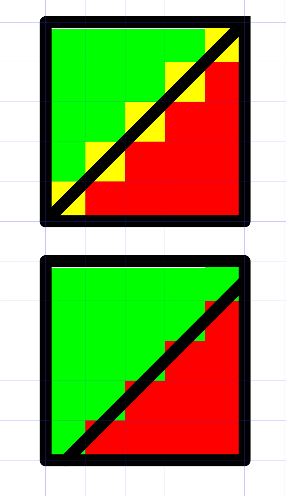
45 degree edges in particular are ambiguous because the edge will always pass directly through the center of each pixel. Take the first square in the attached image, with two triangles sharing an edge - should the pixels along the edge (marked in yellow) be part of the first triangle, or the second?
One way to remove the ambiguity would be to offset the edge by a fraction of a pixel, as shown in the second square - but that would require fillPoly to accept fractional coordinates.
1 Attachment
-
• #20
Ok, just to let you know that the new font is now it current builds and the emulator: https://www.espruino.com/ide/emulator.html
It supports a whole bunch of non-ASCII characters now too, and uses https://github.com/espruino/Espruino/blob/master/scripts/fontmap_v0.3.svg as a base.
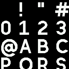
What is your feeling about font sizing? The current font is smaller (for the same 'size' argument). I could make it bigger but then we're in a situation where if you set the height at 24px and draw a 24px high rectangle, not all the text will be contained within it.
2 Attachments
-
• #21
Nice! It's great to see this in the emulator :)
What is your feeling about font sizing?
It might be nice to stay visually similar to the old font, so that people don't have to adjust their existing code as much. Is it smaller because you're leaving room for diacretics? (Edit: nevermind, diacritics do not appear to be included in the font height.)
By the way, I notice that there appears to be missing vertices in a lot of characters. Did you by any chance use svg2bangle with default settings for the initial conversion? If so, you should make sure you run it with the error tolerance set to 0 so that it doesn't do any unwanted simplification.
1 Attachment
-
• #22
It supports a whole bunch of non-ASCII characters now too, and uses
would be nice to have those chars too.
£ as 163
© as 168
® as 174
ß as 223Sorry, got zero Inkscape know how, so I can't add them, but would like to learn it
Edit : ß is B
-
• #23
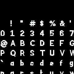
Hm. Looks somehow interesting. This pic is from an existing app in the emulator.
1 Attachment
-
• #25
I can add those. ß is currently mapped to B, .......
@NebbishHacker - Thanks
Edit: Which tools do you use to modify or add chars?
 NebbishHacker
 Gordon
 MaBe
MaBe allObjects
 Tx
Tx
Hi! Recently we've been really pushing up against the limits of what we can fit in Bangle.js's firmware (not helped by ~90k of Tensorflow!). One of the big blobs that takes up space in Bangle.js is actually the vector font (5kB), and I've been itching to try and find a way to improve it as it doesn't look great at the moment.
There's an issue on GitHub open for it at https://github.com/espruino/Espruino/issues/1721
But basically it boils down to:
Use a Hershey font
These are old-school vector fonts designed for plotters. It seems they could be packed into about a 1.5kB of flash, and would scale down really nicely. The gotcha is we'd need a way to draw lines bigger than 1 pixel wide, and they won't render very quickly because it's not easy to fill large areas.
Design our own vector font
I'm imagining a filled font where each character was:
We could just have an SVG file and a write a script to extract the data from it.
I'd tried to export existing fonts, but we're pretty limited in what we can get in such a small footprint (see the GitHub issue) so I think we need something that embraces the limitations (ie polygons rather than smooth).
Would anyone be up for giving this a try? I uploaded my rough and ready test SVG file here - I reckon something in that form would be great - realistically for now it only needs to be the top half as well.
2 Attachments