-
• #2
Could the current Messages app be split into 4 apps, for each type of notification? Then it would be easier to have alternatives, and to pick and choose between them.
I really like this idea.
Take a look here: https://github.com/espruino/BangleApps/issues/1378
-
• #3
On the one hand, in my fork (still wip) I already changed the library to do
Bangle.emit("message", type, event);, so it would be relatively easy to just split it up and doBangle.on("message", (type, msg)=>{ if (type !== 'text') return; // handle text messages here });One problem with splitting it up is that instead of just installing a messaging app, users would need to install 5 apps (also for alarms) to get all notifications (6 if you also count the
androidlibrary). I think that would get rather messy even before you get multiple alternatives for each.On the other hand, I think it would indeed clean things up a fair bit to properly split the code, although switching between e.g. playing music and incoming messages might become less smooth.
-
• #4
Could the current Messages app be split into 4 apps, for each type of notification?
My big concern with this is that rather than pooling resources and making one good app, we just end up with loads of separate apps that are all broken in their own unique ways. For new users IMO it'll life very confusing and arguably worse than just having one sub-optimal app that works.
What specifically is it you want to change/fix? If I changed the messages app such that when it was going to display a plain message, it did something like:
if (file_exists("messages.custom.js")) require("messages.custom.js").show(msg);
else original_message_display();
Then you'd be able to create a new app that overrode the default message display behaviour while the 'default' would still be an easily-installable single app.
But do you also want to change the way the message list works?
Because if so I think it's better to just make a whole new app. I doubt anybody is going to test what happens if you have your music app but someone else's messages and the default message list, and I imagine what we'll end up with is a bunch of apps that only work reliably if installed in the correct combination, which'll be a disaster for most users.
Right now I think android/iOS do depend on the
messagesapp but actually making the change so they only depend on an app of typemessagesis pretty straightforward - basically what we now do fortextinputwith keyboard apps, or used to do for notifications on Bangle.js 1. -
• #5
Thank you for the feedback Gordon, rigrig and Alessandro.
I can see the sense in Gordon and rigrig's points, splitting will be confusing and messy. Alessandro, thank you for pointing out that GitHub issue, I didn't think to look there! I think I've got carried away with the 'proper' way to design software, and forgotten about having something usable for everyone. I'll put aside thoughts of splitting up the
messagesapp then, and focus on potential improvements to it.@Gordon, I like the idea to put in a custom display code, that would be neat. So I could make a new app that wrote to the
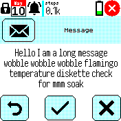
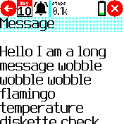
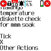
messages.custom.jsfile, and it would use that? That would be useful if you want to keep the message view as it is, but I'll explain my proposed changes below:I didn't want to do anything earth-shattering, just make messages easier to read, without needing a free hand to tap the message to enlarge. See the screenshots below. I was going to look at replacing the current static message view, with lots of space taken by big buttons and big header, with the sort of
E.showScrolleryou get when you tap the message, but preferably with nice buttons at the bottom.For short messages, there wouldn't be much difference, you would still see the buttons at the bottom of the screen, but for longer messages it wouldn't have to shrink the text down, it could just be scrolled up to get to the action buttons.
3 Attachments
-
• #6
So I could make a new app that wrote to the messages.custom.js file, and it would use that?
Yes, that's the idea!
But... What you're proposing sounds like a great idea, and I'd be more than happy to replace the main messages app with that.
Just some thoughts on implementing it...
- You could do a scroller with each 'scroll item' high enough for 2 lines of text. That way you could still have space for the icon at the top
- It's been suggested that swipe left/right could be used to handle the relevant actions rather than buttons, and you could just mention this right at the bottom of the scroller (back seems like it's not needed now you can just tap in the top left or use the button)
- You could do a scroller with each 'scroll item' high enough for 2 lines of text. That way you could still have space for the icon at the top
-
• #7
Thank you Gordon! I'll keep working on it. So basically I shouldn't have worried about changing things in the first place!
- Double high scroller sounds like a good idea, I'll use that.
- What actions are required?
- Tick - opens the notification on the phone / responds positively - swipe right?
- Cross - dismisses the notification on the phone / responds negatively - swipe left?
- Delete?
- Mark Read/Unread?
- Each message menu also has 'Mark all read' and 'Delete all'. Should these move to the main list of messages?
- Tick - opens the notification on the phone / responds positively - swipe right?
- A note at the bottom showing the swipe actions is a good idea, something like
<- X _ _ _ _ Tick ->.
- Double high scroller sounds like a good idea, I'll use that.
-
• #8
That sounds good!
What actions are required?
I'd go for:
- tick (not always available - see the code)
- cross (not always available - see the code)
- back (marks read) - use the back icon in top left for this (which also uses the physical button)
- more options menu (mark unread, delete, etc)
What I'd considered was moving the menu icon over to the right-hand side of the title bar (so it doesn't conflict with the 'back' button in the top left) and then making it so tapping on that brought up the 'more options' menu?
Should these move to the main list of messages?
I think it might still be handy to have them there. I guess we could get rid of the 'back' menu item in the main list (using the built-in back option instead) and then add 'more options' as the last menu item in the list? I'm not sure if that's worth it though since clicking through to a message, doing 'options' and 'delete all' is still pretty easy.
I just realised I had a branch here where I got rid of the 'back' buttons and used the built-in functionality already - I was waiting until more people were on the 2v13 release, but I'll merge it in now
- tick (not always available - see the code)
-
• #9
... just merged those changes
-
• #10
back (marks read)
This is something that has confused me re: the current stock message notification app. I'm still not entirely clear on what the difference between "checkmark" and "X" is. I've noticed that about half the time, the checkmark opens the app on my phone.
For my personal needs, I essentially never want that to happen. The only two options that would be relevant to my workflow would be:
- mark as read on phone and watch
- mark as read on watch only
I never want to use the watch to open the relevant app, my phone can already do that from the pulldown menu.
I also never want to exit a message dialog without marking it as read on the watch - having a backlog of notifications on my phone is already overwhelming enough, but having to navigate to the Messages app on my Bangle, then painstakingly delete ones I accidentally missed (or dismissed with the button rather than the screen) one by one is a chore. Essentially, my preferred functionality would be one and done - the only decision I have to make when faced with a message popup on my bangle should be whether or not to mark it as read on my phone. Then it's gone.
I assume that's something I could figure out how to implement on my own next time I have some real free time to sink my teeth into.
I'd also very much like for the buttons to be considerably larger - and stretch to the edges of the display - so that I can address those message popups without having to stop moving to aim for the buttons.
Another question, actually - is there a way to completely disable the Messages widget? At least the visible/clickable one so that I can still get popups when in apps other than the watchface. Like I said, I want to completely do away with watch-side unread notifications. Having app icons on my widget bar at all is something I see as a minor nuisance more than anything.
- mark as read on phone and watch
-
• #11
I'm glad you said that, it sounds like you want similar things to me! You might want to check out my Messages Notification app (you should also install Notifications Overlay.)
They aren't finished yet, I need to get back and finish them off, but should be more like you want.
Features:
- Instant (ish), full text notification in a scrollable message.
- No message storage. You see it when the message arrives, then it's gone.
- Customisable font size!
Snags:
- No notifications for calls yet
- Weird colours, highlight should be blue but is actually green?
- Slow for large notifications, like email
- Needs cutting edge firmware, not previous stable firmware.
- Gets overwritten by standard Messages app if you update the Android app.
- Doesn't block events to app underneath yet.
Looking at that list, you may not want to try it yet, but I'll work on it and announce here when it's ready!
- Instant (ish), full text notification in a scrollable message.
-
• #12
Sounds like @Sir_Indy might have something nearer to what you want, but...
the only decision I have to make when faced with a message popup on my bangle should be whether or not to mark it as read on my phone.
Yes, I find the current two buttons annoying too. Gadgetbridge has a few different things a message response can do, and we need to figure out what actually makes sense - opening on the phone is definitely not what I ever want. Maybe we just remove one of the two buttons and use the 'back' button as the 'mark read' version.
It was also suggested that we just kill the buttons and use swipes instead, which could make sense (as long as there was a small on-screen hint as to what was required).
-
• #13
hello, I get involved in the discussion.
a while ago I was trying to do the same thing and make it "legacy".
in the end I decided to modify the android app and message to make everything work the way I like it (like the pebble notifications) and I never published it.
With the latest updates I have seen interesting things and I wanted to try to rewrite the message app so that it works with the new version of the android app and the new features.
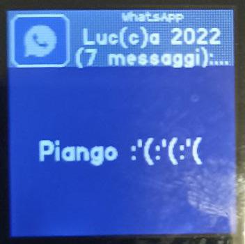
If you want, @Sir_Indy we can work with it (it counts that the graphic part, unless modified, is already partially functional)attached an example of notification (with long texts, the text can be scrolled by tapping at the top or bottom of the screen)
To exit the notification just click the physical button
1 Attachment
 Alessandro
 rigrig
 Gordon
 Sir_Indy
 morganwable
 Rarder44
Hi,
I know there are many threads about the messages app (at least these: 1, 2, 3), so I don't want to try to change it. I would like to try and make an alternative messages app though.
My problem is that I don't want to also make a Calls, Music and Maps interface. Since the Messages app currently handles all of these, and the Android app requires the messages app, at the moment I can't make an alternative messages app without them. (Now I nearly have a nice keyboard app I'd also like to be able to reply to messages, but it sounds like there are problems there. But one step at a time).
Could the current Messages app be split into 4 apps, for each type of notification? Then it would be easier to have alternatives, and to pick and choose between them.
If this sounds sensible I'm happy to try and split them, but it does sound like a lot of work so don't want to start down that route without knowing if it would be useful.