-
• #52
Not been very successful with the segment image approach.
Below is first drawing the image through rotating the segment.
The imgae is 2 bpp, cant get 1 bpp to work at the moment.Not very happy with the results so far - might have to revert to editing the segment pixel by pixel to get it right.
Test code below:
const h = g.getHeight(); const w = g.getWidth(); function draw() { var date = new Date(); var timeStr = require("locale").time(date,1); g.reset(); g.setColor(g.theme.bg); g.fillRect(Bangle.appRect); g.setFont('Vector', w/3); g.setFontAlign(0, -1); g.setColor(g.theme.fg); g.drawString(timeStr, w/2, 30); drawGauge(40, 130, 0.9); } var gaugeImg = { width : 8, height : 7, bpp : 2, transparent : 1, buffer : E.toArrayBuffer(atob("qqWqqqqqqqmqqaqpVqk=")) }; /* var gaugeImg = { width : 8, height : 7, bpp : 1, transparent : 0, buffer : E.toArrayBuffer(atob("AwAAAQEB4Q==")) }; */ function radians(a) { return a*Math.PI/180; } // p will be the number of segments for now function drawGauge(cx,cy,p) { var i = 0; var r = 25; var x; var y; var startrot = 0 - 180; var midrot = -180 - (360 * p); var endrot = -360 - 180; g.setColor('#0ff'); // cyan // draw guauge for (i = startrot; i > midrot; i -= 6) { x = cx + r * Math.sin(radians(i)); y = cy + r * Math.cos(radians(i)); g.drawImage(gaugeImg, x, y, {rotate: i}); } g.setColor('#888'); // grey // draw remainder of guage in grey for (i = midrot; i > endrot; i -= 6) { x = cx + r * Math.sin(radians(i)); y = cy + r * Math.cos(radians(i)); g.drawImage(gaugeImg, x, y, {rotate: i}); } } g.clear(); Bangle.setUI("clock"); Bangle.loadWidgets(); Bangle.drawWidgets(); setInterval(draw, 60000); draw();
1 Attachment
-
• #54
I guess you linked me unintentionally and wanted to link @HughB, right?
But i can help here: bpp is the color depth (bits per pixel):
https://en.m.wikipedia.org/wiki/Color_depth -
• #55
It may still be the right approach but there could be an issue with exporting from SVG to PNG for small sized images. Some of the pixels were dithered. Thanks for your help. I'll do some more experiments and come back to you if I need anything. Really apprecaite the time you have spent on this, its not something I could have done.
-
• #56
What about adding drawGauge() and fillGauge() to the graphics lib?
-
• #57
@myxor Yep, sorry for that, and thanks for your answer.
It actually helped me to find out that I can change the exporting settings of the .png in inkscape (see picture below for details, or this page for more details). Unfortunately, I don't get what I should change to make it more usable for @HughB . Yes, you said I can have a break, but I like to investigate and I'm a bit stubborn sometimes.
1 Attachment
-
• #58
What about adding drawGauge() and fillGauge() to the graphics lib?
Once they produce really crisp results I would agree. But I dont think we have yet found the best way to do this.
@Fteacher - I tried some experiements with gimp last night and have come to the conclusion that I will use a series of fixed images at different percentages to do a really crisp gauge. Trying to draw crisp images on this hardware is subject to lots of limitations. If the screen resolution was more like 360x360 it would be less of a problem. Most of the latest smartwatches are using much higher resolution.
I dont need any help at the moment. Will share some results (which are looking really good) soon.
-
• #59
OK here's the results of my experiements.
I have produced a prototype clock that I am going to callthering.
I manually built 14 images in gimp.
I then work out which one is the nearest fit and display the step count in a big ring.
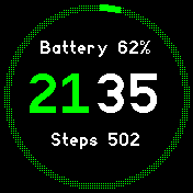
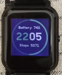
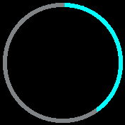
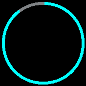
I'm really pleased with the results. It looks really crisp and there are very few wrinkles and ripples in the ring. The screenshot does not do it justice. The greying out of the unused part of the ring is acheived by using a dithered color. So if the colour is green#0f0then the greyed out part is done in '#020'.Below are some examples of the stages of the ring and my prototype proof of concept clock. I will redo this clock with better fonts and add some of the features I have put in the pastel clock. I think the result will be very pleasing (at least to me anyway).
5 Attachments
-
• #60
Very excited about that ! If it's something people can reuse easily in different apps, that's awesome.
-
• #61
I have just done a PR for 'The Ring' which is a proof of concept,
it has a massive memory footprint of 70% ram - which I should fix soon.
https://hughbarney.github.io/BangleApps/?id=theringAnd a new clock called 'Daisy' which is derived from 'The Ring', 'Pastel' and 'Lazybones'.
https://hughbarney.github.io/BangleApps/?id=daisy
I fixed the memory issue on this one and its back to 13% Ram usage. -
• #62
Well done @HughB ! I like the ring .
Do you think this could be used for a run app to show remaining distance, or HR zones ?
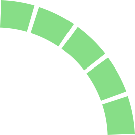
Also, for this purpose, do you think a variation of the ring that looks like the attachement is doable ? I think this kind of design may also please people's eyes.
1 Attachment
-
• #63
do you think a variation of the ring that looks like the attachement is doable
I think we would have to try it out.
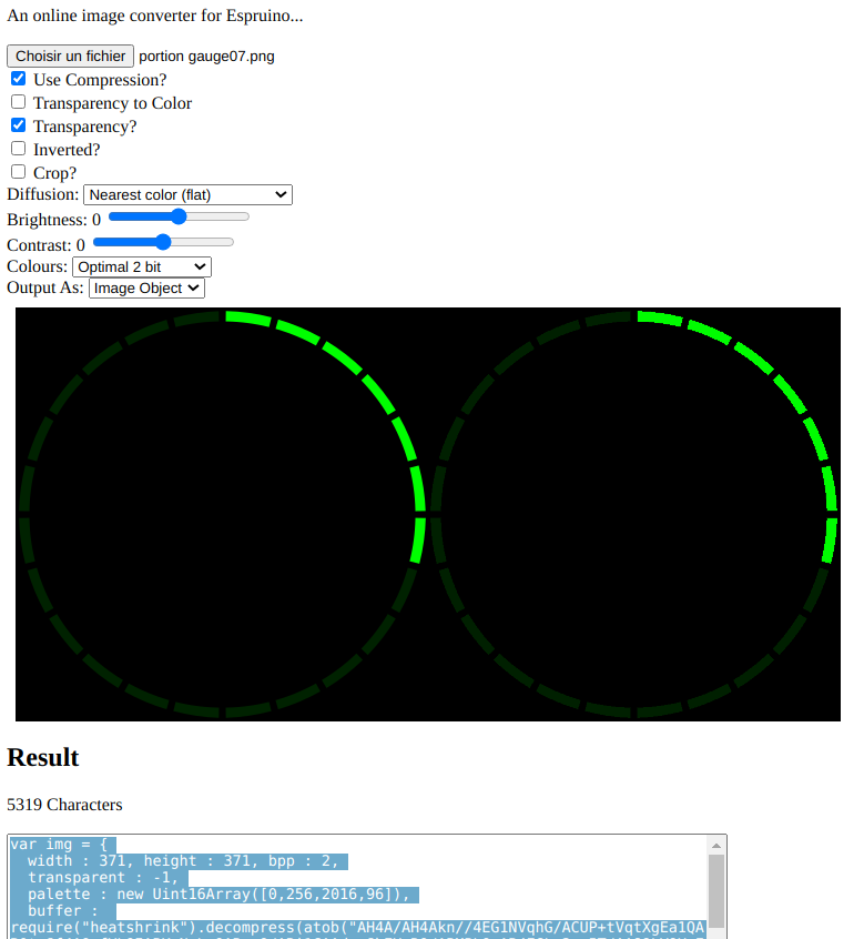
Simplest way to test this in one go would be to make a 178x178 pixel PNG image.
Have a look at the Ring README file to see how I built it up.
Then I suggest making one image of 178x178 pixles with the % at 65%
You will have 4 colours to potentiall deal with.
The background - do black first
The primary ring color
The greyed out part of the ring
And now the gaps - the gaps could background or the greyed color.
The colours need to be 3 bit colours only.
The greyed colour can be dithered - but any other dithering on the main ring will look raggyOnce you have such an image I will run it through the image converter and we can have a look at how it looks in practice. I could write some simple instructions / code for you to try out different images.
There is also the image clock that allows you to upload and image.
-
• #64
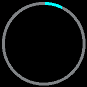
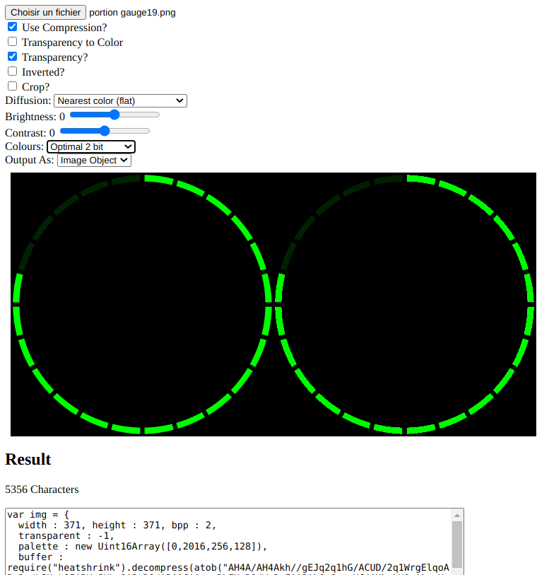
I have no experience with that, so this is my first shot! I did it with inkscape, it's easier for me to modify it once the drawing is ready. I used 13° with 2° black between each section and therefore I have 24 sections.
3 Attachments
-
• #65
Thanks @Fteacher - the images need to be 178x178 pixels - this is to match the size of the Bangle JS 2 screen. The images above are 371x371. This means the images will need to be scaled by some other software tool. Once you start scaling an image you loose image quality and it may not look right, gain artifacts etc.
Is it possible to redo in 178x178 pixels. There is no need to use the imageconverter at this point in time. Once you have a PNG file it can be uploaded using the IDE and viewed on the watch by installing the
simple image viewerapp.
https://banglejs.com/apps/?id=showimgTo upload an image through the IDE
- go to the IDE at https://www.espruino.com/ide/
- Click the top right to connect to your watch through BLE
- Once a connection is shown the IDE top right will go GREEN.
- click in the drum symbol in the middle of the screen.
- select upload and browse to your image and rename the file to
showimg.user.img. - now start the simple image viewer app and you can see what your image will look like on a B2..
- You can take a screenshot through the IDE by typing
g.dump();in the left hand window. - Then click on the image and it will download the screenshot and you can share it here.
- go to the IDE at https://www.espruino.com/ide/
-
• #66
Just FYI the screen is 176 x 176 (not 178) so that should really be the target for image sizes
-
• #67
That explains why my circle is close to the edge !
Thanks @HughB for your very detailed tuto. I would have found out, but you saved me time.
I made the drawing at the good size in Inkscape, but didn't notice that in one of the menu another option was resizing it.
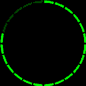
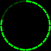
Below the first version, and another thicker version with a 1 pixel margin on each side. I think the 2nd one is better. On the watch it looks really different. I'm adding the file as fake .txt
3 Attachments
 HughB
HughB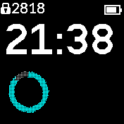
 Fteacher
 myxor
myxor MaBe
MaBe
 Gordon
This has no technical only estetic reason.
I gonna see if i can use that space as well soon :)
Thanks