-
• #27
Agree, ease of use, accessibility, consistency, then clarity and elegance.
-
• #28
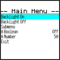
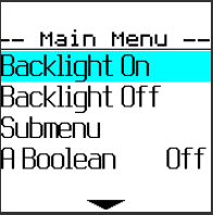
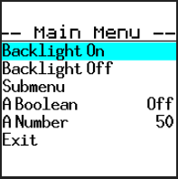
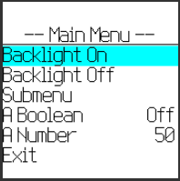
Just resurrecting this... These are 3 different bitmap fonts I just tried out (plus the original).
Any thoughts? My gut feeling is the big one is nice, but just too big to get anything useful in. We might be able to make it work if it was a bit thinner.
Best bet to me looks like the 2nd biggest? You can still get 6 items on a page if needed but it's definitely easier going than the original one I'd tried. A bold version of the same font might be more readable but I do like the cleanness of the current one.
4 Attachments
-
• #29
Well, ask 10 persons and you'll get 20 answers :-)
To me the easiest to read is the one with 2nd biggest one and bolded. Now, this is said without having a clue how small the text will be on the watch display itself. As a side note, on Bangle v1 the date with the default watch face is completely unreadable for me, even with reading glasses, only a magnifying glass can help me read the date.
I'd also appreciate if the text would not be "touching" the frame, is it possible to add a couple of pixels margin? -
• #30
Thanks! Yes, I think that seems sensible, especially with the margin change.
IMO the font could be a little less wide? I guess it's possible I'll end up tweaking the font slightly to customise it.
-
• #31
No 3 from the top - but with a font height of 20 so that you get 6 options per screen. As shown it looks like you would still get 8 options which is too small. However it looks more readable than the existing font for showMenu();
Its not easy finding a font that works and looks nice. I have just spent a couple of hours trying out various ones on fonts.google.com. The problem is that 300 fonts come out too spidery and weedy, where as regular 400 fonts come out thick and blotchy.
I have tried out most of these but they all look very similiar at 400.
https://www.justinmind.com/blog/best-font-mobile-app-design/Attached is my hackemnu.js code.
test code I am using once that is installed is:var hackmenu = eval(require("Storage").read("hackmenu.js")); var m = { "" : { "title" : "Settings" }, "Make Connectable" : function() { LED1.set(); }, "App/Widget Settings" : function() { LED1.reset(); }, "BLE" : function() { LED1.set(); }, "Debug Info" : function() { LED1.reset(); }, "Beep" : function() { LED1.set(); }, "Vibration" : function() { LED1.reset(); }, "Quiet Mode" : function() { LED1.reset(); }, "Locale" : function() { LED1.reset(); }, "Exit" : function() { }, // nothing for now }; hackmenu(m);
1 Attachment
-
• #32
the second from the top, I would really like everything like this (or the possibility of enabling it).
Possibly a scrolling or more windows as some devices do, but zero reading problems in any condition. -
• #33
I like the second one from top
IMO the font could be a little less wide? I guess it's possible I'll end up tweaking the font slightly to customise it.
yes, that would be nice
-
• #34
Well, ask 10 persons and you'll get 20 answers :-)
Yes, that sounds about right :)
I think converting existing web fonts is probably a non-starter as they're not designed for 1bpp rendering. Potentially we'd have to take a font, render it to 1bpp and then tweak it manually pixel by pixel to remove the jaggies. The fonts above are from https://github.com/Tecate/bitmap-fonts and at least they are designed for 1bpp
I have a feeling what's going to happen is I'll go for something in the middle, but then I'll provide some apps that allow you to change the built-in menus either to make them bigger or smaller.
-
• #35
I have a feeling what's going to happen is I'll go for something in the middle, but then I'll provide some apps that allow you to change the built-in menus either to make them bigger or smaller.
Like that!
-
• #36
Interesting site. I remember messing on with X11 font.
Is there a way of trying these in your image converter ?Making the Menu Size / Font configurable is probaly the way to go. Each to his own poison.
-
• #37
I'm afraid right now I have a massively hacky script I use for conversion that's not part of Espruino - so no easy way to try them I'm afraid
-
• #38
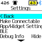
The standard 6x8 scaled at 2 is actually quite an acceptable font for the menus in settings.
- thick enough to read
- thin enough not to look blotchy
- produces 6 lines instead of 8 per screen
- the font is already available as a system font
- nicer than the other samples that were demo'd above (in my opinion)
- its pretty close to some of the X11 fonts.
If this is what had been used on the B2 when I had first seen it I dont think it I would have noticed any usuability issues.
To make some of the menu text shorter,
App/Widget Settings => App Settings
1 Attachment
- thick enough to read
-
• #39
The standard 6x8 scaled at 2 is actually quite an acceptable font for the menus in settings.
I like it
-
• #41
There's now a tutorial on how to modify menus and things yourself at https://www.espruino.com/Bangle.js+Modification
-
• #42
Thanks @Gordon - we can now die by our own mis-configurations.
I had a look at this and got as far as.
https://github.com/espruino/Espruino/blob/master/libs/js/banglejs/E_showMenu.min.js
The code is mimified ? Is there a way to unmimify ?
It does appear that the menu font is set 6x8 x2. -
• #43
Sat 2021.10.23
Is this what you are after?
https://github.com/espruino/Espruino/blob/master/libs/js/banglejs/E_showMenu.js
-
• #44
Yes, makes sense. I did not realise there were two versions and associate_min as being mimified- obvious now - doh!
 HughB
HughB Gordon
 ThomasVikström
 uname
uname MaBe
MaBe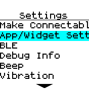
 Robin
Robin
I think the most important thing is accessibility.
imho this must be optimized for use at the desk but also during an outdoor activity.
I am attaching a video of one of the most used devices in the world, all menus are identical, clearly legible and selectable with the buttons (nothing prevents you from using them even touch if necessary).
It's just an example, a simple one that I hope will be useful.
1 Attachment