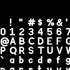
-
• #27
Fixed - loads great now: https://www.espruino.com/ide/emulator.html?gist=27711cd5003478d18f3c0dbea9e6cb61&upload
Sorry - I was originally using your demo code and everything was ok, then for the most recent change I reconverted it and must have messed things up.
I also pushed my other change, which was to move fillPoly to using 16x fixed point numbers, which should make this stuff a lot smoother. @NebbishHacker I know you'd got some demo code that did rotation with your SVGs, and now you can just avoid doing
Math.roundon the coordinates you send in and they should move much more nicely.
1 Attachment
-
• #28
Final thing to add is that
idoesn't render properly with accents because the.at the top gets in the way.Not sure quite how to fix that - maybe I'll add a special
iwithout a dot to the list of accents. -
• #29
@MaBe I'm just using Inkscape.
@Gordon I'm not sure if I'm the best judge of what's used much... I'll do my best though. I should have some time to work on it more tonight.
I'm a bit confused about code pages, by the way. The Espruino fonts page says it uses ISO8859-1 / the first 255 code points of Unicode, and then mentions the Euro symbol, which neither of those contain. The FontDylex7x13 font appears to be using the Windows-1252 code page - is that where the Euro symbol comes from?
-
• #30
Fixed - loads great now: https://www.espruino.com/ide/emulator.html?gist=27711cd5003478d18f3c0dbea9e6cb61&upload
Wow, this is really nice. I was not really using vector font (even compiled it out from build to save space) becasue the output quality was not that great but this is very good. Thank you @NebbishHacker
Since it is vector based, can it be scaled in both dimensions? like g.setFont("Vector",14,16) so the height is 14 and width of largest letter 16 - i.e. to make it more fat? Or thin/condensed when I really want to fit more letters but still have the full height available?
-
• #31
Ahh. Yes. Generally I have been treating it as ISO8859-1 in the tools but then stuff like euro got shoved in there because we needed it. Looking at the differences to ISO8859-1 shown in https://en.wikipedia.org/wiki/Windows-1252 it's basically Windows 1252 - except really we only care about the euro from 1252 :)
-
• #32
Shouldn't have to worry about the dot on the i -- not used with accents
https://en.wikipedia.org/wiki/ISO/IEC_8859-1 -
• #33
Took some forgotten unused DS-D9 fitness band with very small hard to read display, updated to latest Espruino and with this font at size 19 the clock is now very readable and fits perfectly https://streamable.com/lmdtd8 Thank you.
-
• #34
I've added
¡¢£¤¥¨©«¬®¯°±´µ·¸»¼½¾¿ÆÇÐ×ØÞßæçð÷øþ. I also added a dotless i to the accent list.At this point the accent handling code should only have to handle the accents ◌̀◌́◌̂◌̃◌̈.
The only ISO 8859-1 symbols still missing are
§ª²³¶¹º.@Gordon, would it work to give each letter a something like a 14x18 grid instead of the 16x16 grid, and encode the points as x+y*14? After seeing the font in action there's a few symbols that I think would benefit from a bit more vertical space.
1 Attachment
-
• #35
GREAT WORK
Can please take a look at the
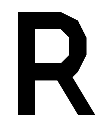
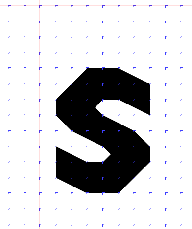
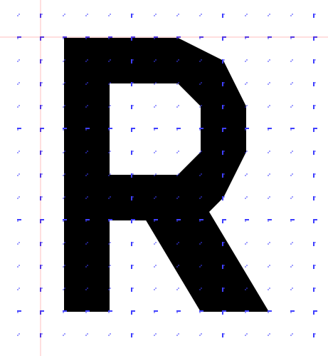
Rand thesand check if it is possible to improve them?R: the line that make a P to a R could be wider
s : might look nice if more thinner and more round than sharpThe
€look's now very nice!
2 Attachments
-
• #36
I'm afraid I can't make the angled line on the R thicker without making it entirely too thick, due to the limitation of the grid.
The small s was really tricky to design on the grid. I've attached a version that's a bit thinner and arguably more rounded, but I'm not really sure if I like it more... it ends up looking kind of slanted or skewed to me.
2 Attachments
-
• #37
Ok, so it's all because sticking to the grid - I understand - thanks.
-
• #38
due to the limitation of the grid
Which is 16x16 at the moment, so a switch to 32x32 or 28x36 would allow more curved and thicker/thinner chars - correct?
-
• #39
a switch to 32x32 or 28x36 would allow more curved and thicker/thinner chars - correct?
Yes, but it also then means you can't fit X and Y into one byte :)
@NebbishHacker that's great, thanks! yes, we could move to a 14x18 grid if you think that'd make more sense for the characters? Seems like quite a bit of work and maybe stuff like 'W' would be a bit too tricky then?
-
• #40
New version should be committed now! (although not live in the emulator)
-
• #41
W and @ would have to be squished a bit, but I think everything else would fit as is. Mostly I just want to make a few things like the parentheses sit a bit higher. In any case, I'll experiment a bit more to see if it seems like a change worth making.
I was also pondering if it might be better in the long run to include all the accented characters directly.
Pros:
- simpler font rendering
- more direct control over the appearance of said characters
- would make it relatively easy to support custom vector fonts, since all the information required to render a font would be contained in one array + a few parameters
Cons:
- space usage
On a related note, would it make sense to store the font in a compressed form? It has a lot of small repeated elements so I think it should compress fairly well, but I guess compression would make it harder to index into it and access individual characters.
- simpler font rendering
-
• #42
Well, if you're willing to spend the time redoing the fonts then I'd be happy to include them in a 14x18 grid.
In terms of the accented chars, it's a trade-off since the extra code needed for them takes up quite a lot of space too. When it was pretty much just chars 33-127 doing it in code definitely made sense - but yes, now it's definitely less of a sure thing.
For compression, it's a point but I think decompressing each time might make it too slow. I guess it could decompress it to RAM only when
setFont("Vector")was called, but then it's actually going to end up taking up a chunk of RAM -
• #43
Now there is
g.setFont("Vector");
g.setFontVector(size);
What about scaling x and y wise plus kerning?
g.setFont("Vector"); // scaling x = y, kerning default g.setFontVector(x); // scaling in x, y plus kerning g.setFontVector(x,y,k); -
• #44
It's an idea, but maybe not right now :) it doesn't fit in easily with how font size is stored at the moment, and I'm also planning to deprecate
setFontVector -
• #45
I'm also planning to deprecate setFontVector
Good point, I am looking forward to your solution.
// maybe g.setFont("Vector","<size>"): // or with options g.setFont("Vector",{options....}): // or something complete different ;-) ....... -
• #46
After a bit more fiddling, I've decided that it's not worth changing the grid just for the minor tweaks I was considering.
In terms of the accented chars, it's a trade-off since the extra code needed for them takes up quite a lot of space too,
By my math directly including the accented chars would take up a bit over a kilobyte. I'm guessing the extra code likely takes up less space than that?
-
• #47
I'm guessing the extra code likely takes up less space than that?
I just checked and it's 440 bytes. So not as small as you might think. Not having it would be a lot easier for sure.
There might be things we could do to reduce the size of the font in memory too (like another way to store the end of polys, and maybe when fillPoly works better we can get then polygons more complex)
-
• #48
I'm using the vector font. How frequently are there revisions of it, if any?
-
• #49
Not often - it shouldn't change much. There was a big change ~6 months ago when @NebbishHacker massively improved it (and the amount of characters supported) but now I'd expect it to be pretty stable.
 Gordon
 NebbishHacker
 fanoush
 Gus
Gus MaBe
MaBe


 Numerist
Argh. Sorry - looks like I did accidentally leave the tolerance set. I'll fix it now.
Adding some more of the ISO-8859-1 code page would be great. I wouldn't bother with stuff that's obviously not used much though.
@MaBe you can just use Inkscape, on https://github.com/espruino/Espruino/blob/master/scripts/fontmap_v0.3.svg