[DISCUSSION] Alarms & Timers UI #4697
Replies: 1 comment
-
|
Posted at 2022-05-04 by nicoboss I find your suggestion way better (even if it was great already as is), and i agree with the idea to be able to see what is on and off at glance. Posted at 2022-05-04 by uname I agree, "less is more". The checkbox rubs me the wrong way too and makes me think I can enable/disable directly with a tap. Maybe the edit can be enabled with an extended tap? Thank you. Posted at 2022-05-04 by Alessandro Thanks to both of you!
I don't know if the component supports this :-/
What about replacing the checkbox with a different icon? Eg.: It's only an example, this icon is too big and it's opaque. Without the checkbox the user won't think about enable/disable with a tap. Posted at 2022-05-04 by nicoboss
that d be a smart move :) if the boxes cannot be checked. Posted at 2022-05-05 by Alessandro
Sure. I mean, we could show an icon for "alarm enabled" and a different icon for "alarm disabled" Examples: Alarm ON https://icons8.com/icon/116217/alarm-on) Alarm OFF https://icons8.com/icon/116215/alarm-off This way the icon won't look like a call to action (like a checkbox does)! Posted at 2022-05-05 by user140377 I think the (un-)marked checkbox is more easily spotted on the tiny screen. Posted at 2022-05-05 by Sir_Indy This might be unpopular, but my feedback on these changes is mostly negative: I agree with user140377 - the checkbox is very clear on the tiny screen. Worth remembering when looking at giant icons on a computer that the real icon is ~3mm tall, and if the only change is a ~1mm tick or cross in the centre it could be hard to spot, especially if the user has bad eyesight. For the same reason, I liked the previous 'repeat' symbol. Nice and clear, obvious what it means, and symbols don't need translating. Personally I'm quite happy tapping the alarm to take me to a menu with all the options for it. I do like the idea to hide the Bulk Actions behind another layer though, it was making me nervous having a DELETE ALL button there that I might accidentally press! If you want to add more features to the alarms, directly adding a message would be nice, rather than going through Noteify. Posted at 2022-05-05 by Alessandro
It was an idea to workaround the fact that we cannot directly check/uncheck an alarm AND open it because the API is quite limited now (but maybe I'm wrong).
Imho the repeat symbol is not needed. In The problem with a repeat symbol is that it eats too many space: time + days of week + repeat icon = two lines and I'd like to keep all the info on one line. I could add an option so the user can choose compact view vs full view:
(this is only a quick mock with the variants mixed up) (the underscores are needed to move the text to the right as spaces does not work ( @gfwilliams : this is the issue I was referring to in the PR))
All actions require a confirm ;-) Posted at 2022-05-05 by @gfwilliams Thanks! I like the idea of dropping the repeat icon for a list of weekdays. As you say it seems redundant. One option might be to replace just the
I do quite like the idea of removing the checkbox and Alarm/timer text and having an icon. Totally agree on it being hard to tell the difference between icons if they are small, but we also have color to play with - a disabled alarm could be grey (dithered) and an enabled one black. Posted at 2022-05-05 by Alessandro
The
Right, I hadn't thought about colors! Posted at 2022-05-05 by Sir_Indy Sorry I wasn't clear, I didn't mean show the days of week and repeat symbol, I meant show just the symbol, since you need to tap on the alarm to actually do anything with it, and days of week are listed inside. But I can see that having the days of week on the main menu would be useful, sorry to cause confusion. I like Gordon's idea to colour the icon, that should be nice and clear. Depending on the colours, the whole text could be 'greyed out', but I know dithered text doesn't look great so this may not be an option. You could remove the Alarm/Timer text and still make it clear which are alarms and which are timers by changing the formatting. Show alarms as time, e.g. 12:45, 07:00. Show timers as durations, e.g. 5m, 1h20, 12h. Don't know how well that would translate though. Posted at 2022-05-05 by Alessandro
No problem!
I'll make some experiments :-D
Exactly what I have in mind! Posted at 2022-05-06 by @gfwilliams
Great - just a note but you can't directly set the color, so you'll need to have a separate grey icon (not that it's too hard to do though).
That sounds like a good idea - I'd think in combination with an alarm/timer icon it'd make it super obvious Posted at 2022-05-06 by Alessandro What about merging "Repeat" and "Days" menus?
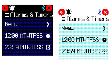
The menu provides some standard dow (Workdays → MTWTF__, etc.) If the default repeat (from Tomorrow I'll publish a demo in my app loader. Posted at 2022-05-06 by Alessandro I just published an early alpha (only alarm, no timer yet), mainly UI changes. https://alessandrococco.github.io/BangleApps/?id=alarm Attachments: Posted at 2022-05-07 by Alessandro
I added a new function to sched module: formatDuration(millis) The sched module contains many functions, maybe we should split it into smaller modules? Some of the functions are more time-related than scheduler-related. Functions like encode/decodeTime, formatTime, formatDuration could be extracted into a new "time_utils" module - what do you think? Posted at 2022-05-07 by Alessandro
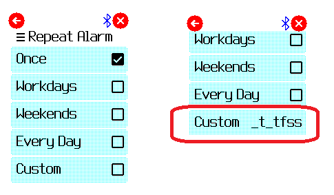
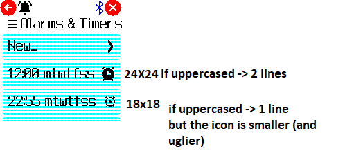
I just tried using a grey icon but the result is not good: it is difficult to read and I haven't found a grey that is ok both on white and dark themes. What if we use filled vs outlined icons? See attached examples (alarm only for now) To keep the uppercased text on 1 line the icon must be 18x18. Using lowercased days a 24x24 icon is fine. Attachments: Posted at 2022-05-08 by Alessandro Update: Latest version is available in my app loader: http://microcosm.app/out/A8f9i (you need to update sched also) Posted at 2022-05-08 by Alessandro Update: the new "repeat" menu! You can select a shortcut (once, weekend, etc.) or you can freely choose the days. Attachments: Posted at 2022-05-09 by nicoboss wow, it looks great and is very practical to use, I love it, thanks Posted at 2022-05-09 by Alessandro Thank you! Posted at 2022-05-09 by @gfwilliams Thanks - yes, I like the 'Repeat Alarm' menu - that makes it way easier to use. For the icons, 24px definitely looks better, but I'm not sure the on/off versions are obvious as to what is what... Maybe just putting a red line through them when they are disabled is better? Posted at 2022-05-09 by Alessandro
I did some tests: Red icon: Green/Red icons: "X" inside the alarm icon: Small X bottom-right: The style of the latter is better imho, I'd work on it. Posted at 2022-05-10 by user140377 Could you also make the "ok" button bigger/easier to hit that appears when there is an alarm? it is kind of hard to hit. Posted at 2022-05-10 by Sir_Indy Looking good @alessandro! I like the last two icon options, with the X inside the alarm icon or the small X. Posted at 2022-05-10 by Alessandro
Thanks!
There is a problem here: capitalised days of weeks take up too much space resulting in two lines instead of one :-( A solution would be to make the icon a little smaller. Icons now are 24x24. A 18x18 icon would work but imho it a bit ugly :-/ I'll try with 20x20. Posted at 2022-05-10 by Alessandro The "OK" button is provided by the built-in function I could change the text so the button becomes bigger, eg. "STOP" or "STOP ALARM"/"STOP TIMER". Posted at 2022-05-10 by user140377 ok, maybe the buttons in E.showPrompt() should generally be made bigger? Posted at 2022-05-10 by Alessandro @Sir_Indy I tried with 20x20 icons and uppercase days of week: Not exactly the best :-/ Posted at 2022-05-10 by Sir_Indy @alessandro don't worry about it, lower case with a larger icons looks better than upper case and small icon. Thanks for trying though! Posted at 2022-05-10 by Alessandro Eventually I would use these icons:
I added a new function to sched module: formatDuration(millis) The sched module contains many functions, maybe we should split it into smaller modules? Some of the functions are more time-related than scheduler-related. Functions like encode/decodeTime, formatTime, formatDuration could be extracted into a new "time_utils" module - what do you think? Posted at 2022-05-11 by @gfwilliams
That sounds like a great idea! It could just go in the The important thing is to make sure that neither it nor the Posted at 2022-05-11 by Alessandro
Great! I'll also add some docs about it.
Ok. Posted at 2022-05-11 by Alessandro This is the "new" time_utils module (work in progress). Posted at 2022-05-12 by @gfwilliams Thanks! I'd probably avoid the Posted at 2022-05-12 by Alessandro Ok no problem! Posted at 2022-05-13 by Alessandro Hi @Sir_Indy, I installed the latest firmware and it includes a fix to the length of a menu text: with this fix there is more room for text before a new line (so I can use uppercased text!). The text is smaller but maybe we could make it less smaller? I mean, current behavior is
I propose:
@gfwilliams Is such a thing possible? Does this make sense? Attachments: Posted at 2022-05-18 by @gfwilliams Yes, that could be done, but it'd require changes in the Bangle.js firmware for it. It also might not look that great since right now all the fonts are different. Ideally we need multiple fonts of different sizes but that are the same basic font style Posted at 2022-05-18 by Sir_Indy Ah sorry, missed this earlier. Don't make things too complicated on my account, I'm happy with lowercase letters. I've installed your latest version, it looks very good, all makes sense, and the icons look good. |


Beta Was this translation helpful? Give feedback.
-
Posted at 2022-05-04 by Alessandro
Hello!
In the last days I made some changes to the default Alarms & Timers app and I'd like to make a few more changes to improve the user experience. My ideas are scattered among issue comments, pull request comments, personal branches, etc. so I'd like to take stock of the situation and involve the community in the discussion.
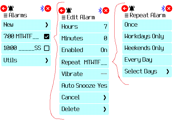
This is the UI now:
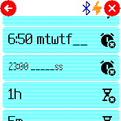
I'd like to add a way to see when an alarm is ON at glance, eg.:
In this configuration:
This way you can see at glance the days an alarm in configured. No days = no repeat (Moreover the repeat icon is no more needed)
I thought about using labels as "weekends"/"workdays" but there could be some issue with translations (eg. "workdays" in italian is "giorni lavorativi", too long)
Moreover I'd like to clean up the interface, eg.:
What do you think? Suggestions?
Beta Was this translation helpful? Give feedback.
All reactions